Kit Making Pen Tool Challenge - SEMI FINALS 2 - "FOOTBALL AND ALCOHOL DO NOT MIX."
This is the second poll from the Semi-Finals of the Pen Tool kit making challenge.
The theme is "Football and Alcohol do not mix." Each player had to design a kit for a team that's been sponsored by an alcohol company in the past, but their designs did not have to have that sponsor on it.
The designers in this group are:
1.Ryanhobbs
Ryanhobbs chose Spurs, who used to have Holsten Pilsner as their sponsor.
He says:
"These shirts have been made using my newly created brand 'black star', I have used the pen tool to create every single feature on these kits, not one thing has been used in form of template, I feel they are not only very good depictions of spurs kits, but also show of some great features of the brand, inclusive of the star featuring in design composition, I feel they are three very strong kits, and have taken alot of effort to design."
Home:
Away:
Third:
2.Dec
Dec chose Rangers, who used to be sponsored by Carling.
Home:

Away:

This poll closes 17:57 Friday 20th AUGUST 2010 so get voting!!!
This is the second poll from the Semi-Finals of the Pen Tool kit making challenge.
The theme is "Football and Alcohol do not mix." Each player had to design a kit for a team that's been sponsored by an alcohol company in the past, but their designs did not have to have that sponsor on it.
The designers in this group are:
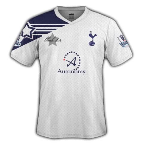
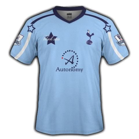
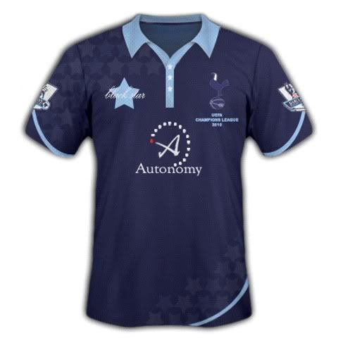
1.Ryanhobbs
Ryanhobbs chose Spurs, who used to have Holsten Pilsner as their sponsor.
He says:
"These shirts have been made using my newly created brand 'black star', I have used the pen tool to create every single feature on these kits, not one thing has been used in form of template, I feel they are not only very good depictions of spurs kits, but also show of some great features of the brand, inclusive of the star featuring in design composition, I feel they are three very strong kits, and have taken alot of effort to design."
Home:
Away:
Third:
2.Dec
Dec chose Rangers, who used to be sponsored by Carling.
Home:
Away:
This poll closes 17:57 Friday 20th AUGUST 2010 so get voting!!!
Last edited:
