So, this is the third poll of the first round of the League Cup:
Eds-99 Vs Pistolped7
For each entrant, I've asked them to give a sentence or two on why they chose that design, so:
EDS-99
"I chose to keep roughly the same colours as the current Brentford shirt, to keep this simple, as it is my first attempt at kits on PhotoShop. I wanted to keep things fairly simple, and therefore the kits are quite standard."
Eds-99 Home:

Eds-99 Away:

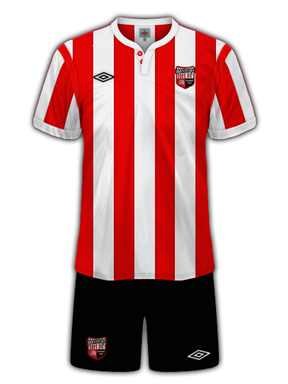
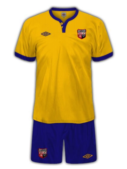
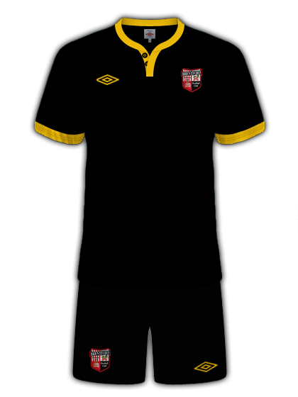
PISTOLPED7
"I went for a simpled, tailored Umbro look, using the collar from Man City's old away kit and adding buttons for a retro feel. The yellow and blue away kit is from back in 1960, when Brentford changed their colours hoping that their poor luck would change. The black and yellow third kit is just there because I think black and yellow go well together, and I think it works with the retro collar too."
Pistolped7 Home:
Pistolped7 Away:
Pistolped7 Third:
So that's both kits, get voting, The poll closes on 23:49 Thursday 5th August
Eds-99 Vs Pistolped7
For each entrant, I've asked them to give a sentence or two on why they chose that design, so:
EDS-99
"I chose to keep roughly the same colours as the current Brentford shirt, to keep this simple, as it is my first attempt at kits on PhotoShop. I wanted to keep things fairly simple, and therefore the kits are quite standard."
Eds-99 Home:
Eds-99 Away:
PISTOLPED7
"I went for a simpled, tailored Umbro look, using the collar from Man City's old away kit and adding buttons for a retro feel. The yellow and blue away kit is from back in 1960, when Brentford changed their colours hoping that their poor luck would change. The black and yellow third kit is just there because I think black and yellow go well together, and I think it works with the retro collar too."
Pistolped7 Home:
Pistolped7 Away:
Pistolped7 Third:
So that's both kits, get voting, The poll closes on 23:49 Thursday 5th August
Last edited:
")
")
