Which Is The Best Logo Style?

  • v1

    Votes: 9 15.0%
  • v2

    Votes: 17 28.3%
  • v3

    Votes: 24 40.0%
  • v4

    Votes: 10 16.7%

  • Total voters
    60
  • Poll closed .
Status
Not open for further replies.

StuW

Why So Serious?
Joined
Apr 14, 2009
Messages
7,729
Reaction score
1
Points
36
As I am looking for an new style to follow SilkySideways, I came up with a few ideas. These are just rough, so rough edges etc aren't too important, as I will sort them all out if I release.

v1 -
logo1.png
dallas.png


Simple, just an embossed outline, with a slight shine to the top half.

v2 -
logo2.png
rmad.png


Textured, with a small inner glow, and shine

v3 -
logo3.png
barc.png


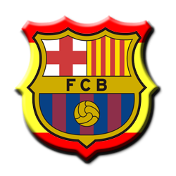
Logo, with surrounding part the national flag of that team.

v4 -
logo4.png
emelec.png


Simple Distortion, with shine and shadow.

Please vote, and give comments/criticism.

Thank You :)
 
Last edited:
o no more silky sideways :( edit- my last comment was to far!
 
I prefer the simpler ones, so voted v2.

I think v4 is too much - nothing will beat SilkySideways for warping logos.
 
I really like version3 there all pretty nice but the flag around the outside is a nice touch

Nice work mate :p
 
I prefer the simpler ones, so voted v2.

I think v4 is too much - nothing will beat SilkySideways for warping logos.

v4 is still a bit of a WIP, looking to improve it. I liked v2 aswell, simple, yet different.
 
o no more silky sideways :( edit- my last comment was to far!

SilkySideways will never be replaced, and will be made available to as many future FM games as possible.
 
Something in between v1 & v2 would be perfect
 
IF you make v4 it will be the best logo's ever:wub:
 
Can you do logos for say the top three clubs in the world from all four styles?
 
i say inbetween 2 and 3, so the lighting of two with the flags? i think that would be beast
 
i prefer the newer ones maybe a different team example
 
Status
Not open for further replies.
Top