Mike
Like a glove!
- Joined
- Feb 5, 2009
- Messages
- 8,121
- Reaction score
- 3
- Points
- 38
HSV
Home:

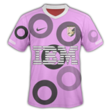
I tried basing this on the new thailand shirt,
but i dunno
something just isn't right with this kit?
thoughts please
I'll tell you what isn't right.. you posted this just after StuW's new rule so I can't see it bigger. Absolutely fantastic mate, keep it up.


")