You are using an out of date browser. It may not display this or other websites correctly.
You should upgrade or use an alternative browser.
You should upgrade or use an alternative browser.
The 'Rate My Kit' Thread
- Thread starter Jake
- Start date
- Replies 4K
- Views 1M
- Status
- Not open for further replies.

Chokopop
Self-diagnosed FM addict
- Joined
- Mar 10, 2011
- Messages
- 4,119
- Reaction score
- 43
- Points
- 48
My poor try at an AC Milan kit with the pen tool. Constructive criticism is greatly appreciated.
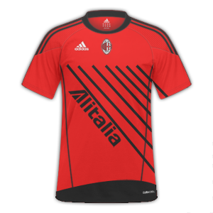
Anyone? :L
Mike
Like a glove!
- Joined
- Feb 5, 2009
- Messages
- 8,121
- Reaction score
- 3
- Points
- 38

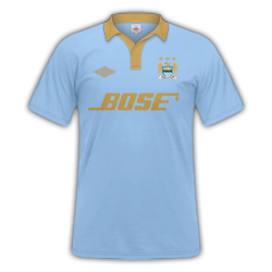
this my first one so i would love to know what you think it's supposed to be an away kit for Blackburn
It's not bad, are you using Photoshop or Smart Shirt Designer?
The Canterbury logo is way too big, should be at least half that size, also the Blackburn badge is a tad too big. Not a fan of the sleeve design but that's personal preference. Sponsor could be notched up a little. Other than that, for a first time, it's pretty decent.
Anyone? :L
were's the black and red stripes lol?
Mike
Like a glove!
- Joined
- Feb 5, 2009
- Messages
- 8,121
- Reaction score
- 3
- Points
- 38
Anyone? :L
Risky job, especially for an AC Milan kit. There's nothing wrong with experimenting, don't get me wrong, but this just doesn't look right. The badge is a bit small too. But it looks as if you're getting used to the pen tool which is a plus
")
Chokopop
Self-diagnosed FM addict
- Joined
- Mar 10, 2011
- Messages
- 4,119
- Reaction score
- 43
- Points
- 48
were's the black and red stripes lol?
Either i'm going crazy, or something's wrong with your eyes. I see stripes lol
Risky job, especially for an AC Milan kit. There's nothing wrong with experimenting, don't get me wrong, but this just doesn't look right. The badge is a bit small too. But it looks as if you're getting used to the pen tool which is a plus
Well, in my defense, i hate working with round-ish badges. I can never get the size right.
I'm sick of making the same old kits where i just re-color the **** thing. So i thought i'd give it a try. I only added the AC Milan badge because i already made the **** kit. It's the only team i could think of with Black and Red stripes. Personally, i think it's hideous as well lol
But cheers for the feedback
Either i'm going crazy, or something's wrong with your eyes. I see stripes lol
traditional milan stripes lol
Chokopop
Self-diagnosed FM addict
- Joined
- Mar 10, 2011
- Messages
- 4,119
- Reaction score
- 43
- Points
- 48
traditional milan stripes lol
That's the point of the whole thing. They're not traditional lol

Blackburn home kit
---------- Post added at 09:06 PM ---------- Previous post was at 09:05 PM ----------
I used smart shirt designer mate thanks for the feedbackIt's not bad, are you using Photoshop or Smart Shirt Designer?
The Canterbury logo is way too big, should be at least half that size, also the Blackburn badge is a tad too big. Not a fan of the sleeve design but that's personal preference. Sponsor could be notched up a little. Other than that, for a first time, it's pretty decent.
cooper123456
Member
- Joined
- Jun 24, 2010
- Messages
- 694
- Reaction score
- 0
- Points
- 0
does any no what colour code on photoshop man city would be as they play in bright light blue and more and im struggling to get it right?
Chokopop
Self-diagnosed FM addict
- Joined
- Mar 10, 2011
- Messages
- 4,119
- Reaction score
- 43
- Points
- 48
does any no what colour code on photoshop man city would be as they play in bright light blue and more and im struggling to get it right?
Look through here and try a few. Compare it to the real kit until you got it right. That's what i always do. Blues Hex Color Codes: Hexadecimal codes for named colors used in HTML page features
cooper123456
Member
- Joined
- Jun 24, 2010
- Messages
- 694
- Reaction score
- 0
- Points
- 0
Thank You Very MuchlyLook through here and try a few. Compare it to the real kit until you got it right. That's what i always do. Blues Hex Color Codes: Hexadecimal codes for named colors used in HTML page features
Mike
Like a glove!
- Joined
- Feb 5, 2009
- Messages
- 8,121
- Reaction score
- 3
- Points
- 38
does any no what colour code on photoshop man city would be as they play in bright light blue and more and im struggling to get it right?
Man City home colour = R 137, G 192, B 239.
cooper123456
Member
- Joined
- Jun 24, 2010
- Messages
- 694
- Reaction score
- 0
- Points
- 0
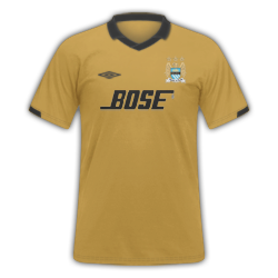
herea are some manchester city kits
Chokopop
Self-diagnosed FM addict
- Joined
- Mar 10, 2011
- Messages
- 4,119
- Reaction score
- 43
- Points
- 48
herea are some manchester city kits
Blue and... **** brown just doesn't go together. Sorry mate. Nice try though :L
Mike
Like a glove!
- Joined
- Feb 5, 2009
- Messages
- 8,121
- Reaction score
- 3
- Points
- 38
herea are some manchester city kits
I actually think the home kit is superb (other than the logo is a tad little). The gold makes it look like some sort of centenary or milestone kit. 9/10 for home, 6/10 away, not too keen.
cooper123456
Member
- Joined
- Jun 24, 2010
- Messages
- 694
- Reaction score
- 0
- Points
- 0
Here Are Some Leeds Kits
Leeds United AFC H/A/T
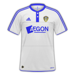
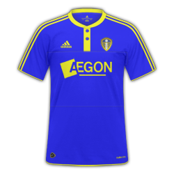
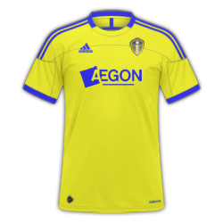
Any Rates Would Be Great
Any Rates On These?
sidgurung97
Member
- Joined
- Dec 2, 2010
- Messages
- 1,482
- Reaction score
- 0
- Points
- 0

Used a kit style jmoser is currently developing. Best kit I have ever made imo!
cooper123456
Member
- Joined
- Jun 24, 2010
- Messages
- 694
- Reaction score
- 0
- Points
- 0
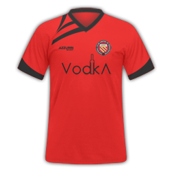
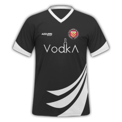
Here Are Some Fc United Kits


- Status
- Not open for further replies.