J
jmoser
Guest
Sick! 10/10 for all of them.
I love that template.
Cheers mate, and I made the template myself so I'm glad you like it. Just one question: Do you think the shirt is too long?
Sick! 10/10 for all of them.
I love that template.
no need be a ***** about it
Cheers mate, and I made the template myself so I'm glad you like it. Just one question: Do you think the shirt is too long?
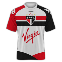
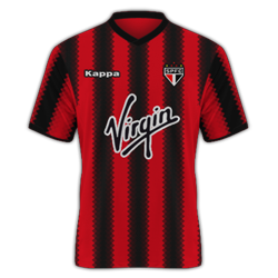
Sao Paulo
My KotW entries
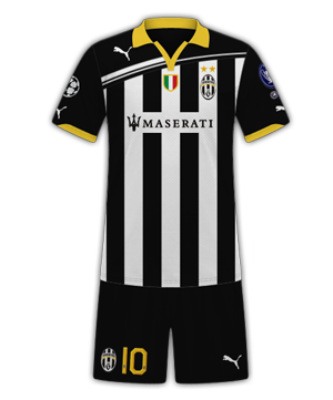
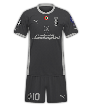

Away is a nice colour scheme and design, but for me the home has too much black.
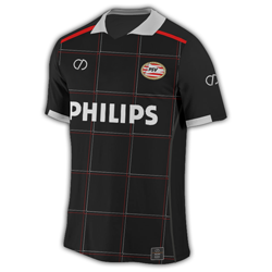
Here are two possible PSV away kits for KOTW, that I can't decide between.
My KotW entries
Hey mate, have you adjusted the texture on the FB template? Every black kit I've seen you make has lacked texture.
") i entered these for the KotW over at unbelievable-jeff...so can't really make any changes now
i entered these for the KotW over at unbelievable-jeff...so can't really make any changes now 
