Except the 3rd's chest area its perfect
Could've changed that easily, but i deleted the psd file..

was trying to give a lighter shade of black...

Except the 3rd's chest area its perfect
Could've changed that easily, but i deleted the psd file..
was trying to give a lighter shade of black...
I think you will find its all one shade of black, the crease is misleading XD
Yeah, it is the same shade..but that area is a bit on the glossy side...and since i'm no expert...i went for a change of shade to make it look prominent....anyways...
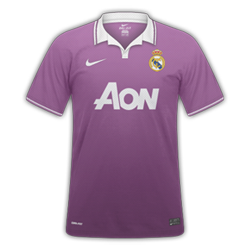
Fantasy Spurs Kits - Comments welcome
Tottenham H/A/T


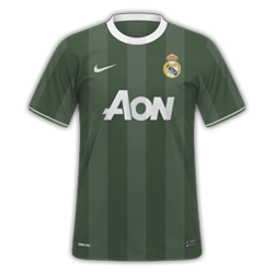
Fantasy Spurs Kits - Comments welcome
Tottenham H/A/T
Juventus

New York Cosmos Umbro Blackout Collection
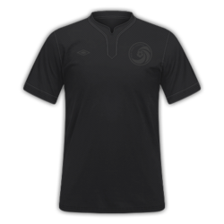
One mistake, the dotted line on the left of the sponsor isn't there, but there is one on the right. Still 10/10
") Fantastic work. 11/10
Fantastic work. 11/10