The 'Rate My Kit' Thread

  • Thread starter Thread starter Jake
  • Start date Start date
  • Replies Replies 4K
  • Views Views 1M
Status
Not open for further replies.
Official Napoli 2011/12 kits
dZpSch.jpg
pO8b1h.jpg
KLGJKh.jpg
 
AC Milan 2011/12 home
hPgcs.png

7/10- There's two inaccuracies that I can see. Some of the stripes are different distances from eachother and and at the side of the jersey on the furthest right stripe there should be a small white and green stripe.
Well done overall though, I'd have nowhere near the skill to make it as accurate as you have. Fix those two things and you have a 10 ;)
Ohhhhhhhhhhhhhhhhhhhhhhhhhhh ****, cheers for correcting it! I'm doing this for a kit pack and nearly forgot those things.. thanks again!
 
You forgot the wierd shoulder stripes as well :), look at mine -

Atalanta H
gpOuk.png


Lazio H/A/T
5JQPY.png
RohIo.png
QzYoG.png


AC Milan H/A/T
5uLGf.png
g8edI.png
TBgtl.png

 
nice Stu - dunno why but i totally love the Lazio third top - impressive stuff as usual tho
 
Stu, the Milan third's sponsor is supposed to be white ;) I'm doing that top right now XD

---------- Post added at 02:48 PM ---------- Previous post was at 02:20 PM ----------

AC Milan 2011/12 H/A/T
hPgcs.jpg
gG8Cm.jpg
0rljp.jpg


EDIT: Ah ****, the weird shoulder straps :S cba to put them in now XD​
 
Last edited:
Man Utd home with my new template. Adjusted a few layers.
manutdp.png


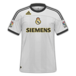
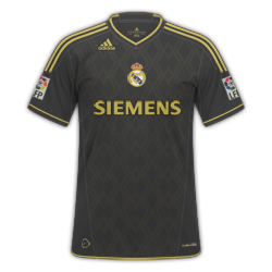
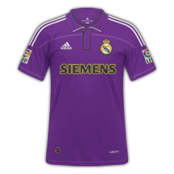
MadridH1.png
MadridH.png
MadridT.png


Rates and advice please? on the third kit i've got a save where 'SIEMANS' is White with no stroke, probably looks better but uploaded this one :)
 
MadridH1.png
MadridH.png
MadridT.png


Rates and advice please? on the third kit i've got a save where 'SIEMANS' is White with no stroke, probably looks better but uploaded this one :)

Have to say 3 excellent kits my favourite being the away :)
 
I personally, hate strokes that stand out too much. So I would tone them down a bit, especially on the home adidas logo. They look out of place to me on the third kit also. Love the away kit though.
 
Status
Not open for further replies.
Back
Top