Just spent a solid chunk of time working on this one. Had to make the logo and sponsor myself, think it turned out pretty good. For an imaginary Stornoway team I'm thinking of making in the database. Any opinions? I'm not sure if I really like the way the sponsor looks, but I'm going off scratch here as the real Hebridean Brewery logo doesn't work on a kit.
You are using an out of date browser. It may not display this or other websites correctly.
You should upgrade or use an alternative browser.
You should upgrade or use an alternative browser.
The 'Rate My Kit' Thread
- Thread starter Jake
- Start date
- Replies 4K
- Views 1M
- Status
- Not open for further replies.
twoleftfeet2
Member
- Joined
- Mar 2, 2009
- Messages
- 54
- Reaction score
- 0
- Points
- 6
I like these, but I'm thinking using the Samsung sponsor with that style kit is just to "Chelsea" looking.
Yeh I know, but they don't sponsor anyone in australian football so I thought Id use it. And I just used the first template in my pack. I did recolour it and change the logo to make a chelsea jersey too.
These are my England kits I was thinking of using for my story soon. Ratings?
(there were clearly resizing issues, ignore that. )
(there were clearly resizing issues, ignore that. )
These are my England kits I was thinking of using for my story soon. Ratings?
(there were clearly resizing issues, ignore that. )
i love them i would buy them in real life
Made these for my dad...
was wondering what you guys think?
[View attachment 120207
View attachment 120208
was wondering what you guys think?
[View attachment 120207
View attachment 120208
Quite good but southampton logo too small
Real Madrid Home
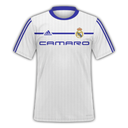
Sponsor too high IMHO 7/10
peskybendben
Member
- Joined
- May 23, 2010
- Messages
- 987
- Reaction score
- 0
- Points
- 0
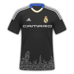
9/10. Love the whole thing apart from the bottom part. It looks like the airbrush from MS Paint came in handy? 


Mike
Like a glove!
- Joined
- Feb 5, 2009
- Messages
- 8,121
- Reaction score
- 3
- Points
- 38
In order:
5 - not a fan of the template, and really doesn't suit Arsenal :S
6 - I love the use of yellow and blue, but I think for an Arsenal away kit there is too much secondary colour, which in this case is blue.
6 - as above.
6 - better than the first three, don't like the collar much though, or the faint lines.
1 - change the team
6 - the sponsor is a little off centre, but you're getting getting better mate.
Decent effort all in all. Kit making isn't easy, admittedly, but keep at it because you are getting better.
If you want to get even better (this is what I do sometimes), study some pre-made kit templates. What I mean is, open up a kit PSD file (e.g. SS'10, then open nike01 or something) and take a look at the use of colours and effects - I think every kit that has a design uses the effects Inner Glow and Outer Glow, sometimes even Stroke. Change opacities until they look good etc. etc.
I think what you need to do is do what I just said ^ there ^, mess around for a week or so then try and go for the kit of your life.
")
5 - not a fan of the template, and really doesn't suit Arsenal :S
6 - I love the use of yellow and blue, but I think for an Arsenal away kit there is too much secondary colour, which in this case is blue.
6 - as above.
6 - better than the first three, don't like the collar much though, or the faint lines.
1 - change the team
6 - the sponsor is a little off centre, but you're getting getting better mate.
Decent effort all in all. Kit making isn't easy, admittedly, but keep at it because you are getting better.
If you want to get even better (this is what I do sometimes), study some pre-made kit templates. What I mean is, open up a kit PSD file (e.g. SS'10, then open nike01 or something) and take a look at the use of colours and effects - I think every kit that has a design uses the effects Inner Glow and Outer Glow, sometimes even Stroke. Change opacities until they look good etc. etc.
I think what you need to do is do what I just said ^ there ^, mess around for a week or so then try and go for the kit of your life.
Manchester United home kit a bit different from their current but not much difference, all suggestions welcome.
Simple but effective - 8/10
S
Sam
Guest
These are my England kits I was thinking of using for my story soon. Ratings?
(there were clearly resizing issues, ignore that. )
wow awesome kits 10/10
- Status
- Not open for further replies.