They are on the info screen for each club. Also are in the match results screen in some skins.Where are these kits used ? They look like kits that people would use on Pro Evo .
You are using an out of date browser. It may not display this or other websites correctly.
You should upgrade or use an alternative browser.
You should upgrade or use an alternative browser.
The 'Rate My Kit' Thread
- Thread starter Jake
- Start date
- Replies 4K
- Views 1M
- Status
- Not open for further replies.
AndersonLFC
Member
- Joined
- Jan 24, 2011
- Messages
- 26
- Reaction score
- 0
- Points
- 0
That is amazing
are these any good? iv put them in the download section...Galatasaray
H|A|T


---------- Post added at 08:38 PM ---------- Previous post was at 06:50 PM ----------
Barcelona
H|A|T
H|A|T


Last edited:
porto home
View attachment 141921
View attachment 141921


pistolped7
Member
- Joined
- Aug 2, 2009
- Messages
- 2,565
- Reaction score
- 0
- Points
- 0
France away top? Looks better full size.

I like it. Simple and I like the template

10/10
10/10, as you eliminated the red & white stripes
Seriously, Sunderland=Red & White stripes. Don't like colours at all. 5/10
~~~~~~~~~~~~~~~~~~~~~~~~~~~~~~~~~~~~~~~~~~~~~~~~~~~~~~~
Manchester United H/A/T


Rates?? Made for a KoTW on another site, sponsor has to be a charity.
They're nice, but the Man Utd badge looks a bit off center imo!
8/10!
porto home
View attachment 141921
any ratings?
peskybendben
Member
- Joined
- May 23, 2010
- Messages
- 987
- Reaction score
- 0
- Points
- 0
Hi.
I just got the Photoshop CS5 Trial to see what it's like for kits. I just want to know how to make an outline of a logo? I see some kits where the club logo is just lines with no filled colours. Please help me, because I think that I have everything done fine up until now.
Thanks!")
I just got the Photoshop CS5 Trial to see what it's like for kits. I just want to know how to make an outline of a logo? I see some kits where the club logo is just lines with no filled colours. Please help me, because I think that I have everything done fine up until now.
Thanks!
peskybendben
Member
- Joined
- May 23, 2010
- Messages
- 987
- Reaction score
- 0
- Points
- 0
...Ok, so sod the logo outlines for now. I just completed my first ever kit set using Photoshop. I used to be a SSD fanboy!  Please, leave any feedback, good, or constructive!
I am excited to see what everybody thinks. I think that my favourite is the away.
EDIT: Just realised the white background, and that they are a bit small. Will upload to Photobucket in the future.
Please, leave any feedback, good, or constructive!H|A|T
I am excited to see what everybody thinks. I think that my favourite is the away.
EDIT: Just realised the white background, and that they are a bit small. Will upload to Photobucket in the future.
Last edited:
...Ok, so sod the logo outlines for now. I just completed my first ever kit set using Photoshop. I used to be a SSD fanboy!
I am excited to see what everybody thinks. I think that my favourite it the away.
i like them i would say 9/10 could you rate my porto home shirt.
peskybendben
Member
- Joined
- May 23, 2010
- Messages
- 987
- Reaction score
- 0
- Points
- 0
@Arsenal James, Thanks. Porto home shirt I would say 7/10. Good ideas but the sizes and positions of some of the logos ruins it a bit. Still, good effort!
...Ok, so sod the logo outlines for now. I just completed my first ever kit set using Photoshop. I used to be a SSD fanboy!
H|A|T
I am excited to see what everybody thinks. I think that my favourite is the away.
EDIT: Just realised the white background, and that they are a bit small. Will upload to Photobucket in the future.
Don't like the home one at all 5/10 but the away and third are really good 8/10
---------- Post added at 12:03 AM ---------- Previous post was at 12:02 AM ----------
porto home
View attachment 141921
Don't like it mate considering your previous work you have done better 5/10
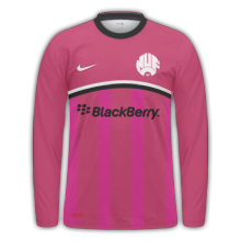
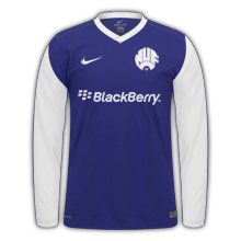
RatesNewcastle H/A/T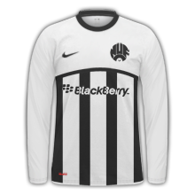
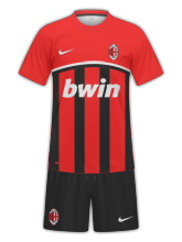
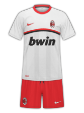
AC Milan H/A
peskybendben
Member
- Joined
- May 23, 2010
- Messages
- 987
- Reaction score
- 0
- Points
- 0
Thanks @MVP93 ")
- Status
- Not open for further replies.