You are using an out of date browser. It may not display this or other websites correctly.
You should upgrade or use an alternative browser.
You should upgrade or use an alternative browser.
The 'Rate My Kit' Thread
- Thread starter Jake
- Start date
- Replies 4K
- Views 1M
- Status
- Not open for further replies.
Calum, can i suggest you somehow get hold of Photoshop? Even if you just get the trial?
You're definately getting better, but I just feel SSD is holding you back.
Oh, and get FB templates...
i downloaded the PS trial last week looked at help guides and still didn't have the foggiest how to use it lol :$


Portsmouth Home.

not sure about the shorts, and the Pompey badge needs to be bigger.
other than that, I'm quite pleased with this
Agree about the shorts.. Think it's the red, which comes from nowhere. Maybe add a bit of red somewhere to the shirt? Other than that, very nice!
rates please ?
Crystal Palace :View attachment 149927
Juventus : View attachment 149926
Atletico :View attachment 149925
Crystal Palace :View attachment 149927
Juventus : View attachment 149926
Atletico :View attachment 149925
Agree about the shorts.. Think it's the red, which comes from nowhere. Maybe add a bit of red somewhere to the shirt? Other than that, very nice!
I agree completely with you, didn't really know where to I could add some red on the shirt though haha.
Thankyou anyway

^^^
CP- 6.5/10 Colours seem a bit too bright. Good effort, none the less.
Juve- 6/10 Design doesn't look that good with the colours. Good effort though.
Athletico- 5/10 Not sure on the purple, doesnt seem to work with the black, red and white. Nice effort though.
---------- Post added at 05:15 PM ---------- Previous post was at 05:13 PM ----------
Blackpool FC 10/11


Bolton Wanderers 10/11


CP- 6.5/10 Colours seem a bit too bright. Good effort, none the less.
Juve- 6/10 Design doesn't look that good with the colours. Good effort though.
Athletico- 5/10 Not sure on the purple, doesnt seem to work with the black, red and white. Nice effort though.
---------- Post added at 05:15 PM ---------- Previous post was at 05:13 PM ----------
Blackpool FC 10/11
Bolton Wanderers 10/11
^^^
CP- 6.5/10 Colours seem a bit too bright. Good effort, none the less.
Juve- 6/10 Design doesn't look that good with the colours. Good effort though.
Athletico- 5/10 Not sure on the purple, doesnt seem to work with the black, red and white. Nice effort though.
---------- Post added at 05:15 PM ---------- Previous post was at 05:13 PM ----------
Blackpool FC 10/11
Bolton Wanderers 10/11
all of them are from kit requests lol , BP Home -7/10 Away 9/10 Bolton Home - 6/10 Away - 7/10
more rates for these :
View attachment 149929
View attachment 149930
View attachment 149931
View attachment 149932
View attachment 149929
View attachment 149930
View attachment 149931
View attachment 149932
Portsmouth Home.
not sure about the shorts, and the Pompey badge needs to be bigger.
other than that, I'm quite pleased with this
nice give that a 8
")
FrankieDolan
Member
- Joined
- Jul 1, 2010
- Messages
- 333
- Reaction score
- 0
- Points
- 0
Portsmouth Home.
not sure about the shorts, and the Pompey badge needs to be bigger.
other than that, I'm quite pleased with this
thats a smart kit 10/10 :wub:


AlexanderKruseBerg
Member
- Joined
- Jun 16, 2010
- Messages
- 166
- Reaction score
- 0
- Points
- 16
Aston Villa


Clearly you haven't been looking through this thread.
To be honest most people don't look through every page of a thread untill they are at the last page with threads like these where you just tend to post kits or look at recent kits.
userfrenzy
Member
- Joined
- Jun 15, 2010
- Messages
- 67
- Reaction score
- 0
- Points
- 0
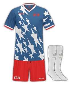
Guys here is another classic kit i made it is USA 1994 jersey
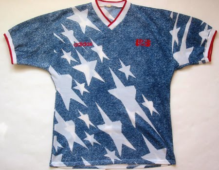
Here is what it should look like
Oiiiii i penned mine way back on page 41 I want recognition aswell !! lol ..and i took the time to sort the collar and the pattern out LOL in fairness i prefer yours and kinda wish i had brightened it up a little, Good work with the new Template btw Rat 9/10.

Last edited:
- Status
- Not open for further replies.