Any more rates?
Nice and simple, realistic too. 9/10.
Don't like the black, I think blue would look much better. 7/10
Any more rates?
Any more rates?
There amazing mate 10/10 :wub:
Nice and simple, realistic too. 9/10.

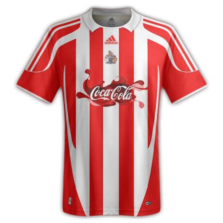
Home- 7/10
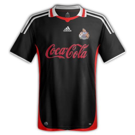
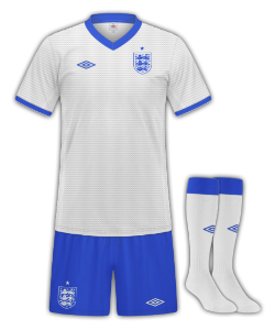
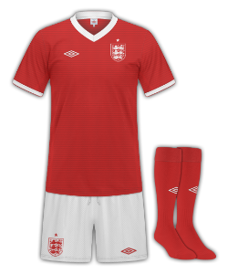
Away- 6/10 The logo looks faulty. (near top)
They both look nice. Simple but effective.
Yeah, thought that would be why. Some of my logos ended up like that.Cheers guys
---------- Post added at 02:52 AM ---------- Previous post was at 02:52 AM ----------
Cos it's been resized.
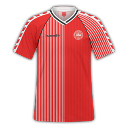
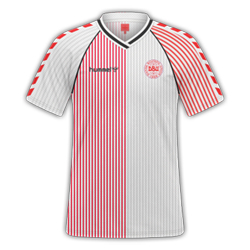
I would like to get some rates on these please, as all of those pinstripes (especially on the sleeves) did take some time to make. Posted them earlier and didn't get any rates. Would appreciate any opinions.

Yeah, thought that would be why. Some of my logos ended up like that.
10/10. Class, just pure class. :wub:
Permission to use in-game?
Any more rates?
I'd give it 8/10 the badge looks weird but other than nice clean kit
Do you either save as .png or merge all visible layers before resizing? Gives the best picture quality.Cos it's been resized.
Do you either save as .png or merge all visible layers before resizing? Gives the best picture quality.
")
Any more rates?
Both simple yet nice, 10/10 as I much prefer them to the shirts we have now..
Do you either save as .png or merge all visible layers before resizing? Gives the best picture quality.
by merging all visible layers, won't that merge the colour overlays etc.?
Al-Ahly Home

That is lush. Nice collar, simple sponsor, awesome socks
10/10, only thing I wouls say is there is no Spurs badge on the shorts and I'm not that keen on the shorts design, but an awesome kit nonetheless.
And come on people, the fact that you 'hate the team' isn't really a good enough reason to score marks off someone's kit!
:wub::wub::wub::wub:
someone who appreciates simplicity
and i know about the shorts, I keep messing the shorts up tbh