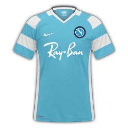
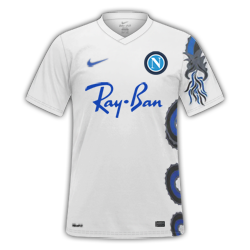
You're being too hard on yourself. It certainly isn't an epic fail. As a matter of fact it is quite good. The v-neck part of the collar is a little off, but other than that it is pretty spot on. 9/10. Unfortunately with the pen tool I don't think there is any miracle tips I, personally, can give. Just practice, and practice. I have found a good way to do this is pick an existing kit design that will require a lot of pen tooling and appears massively ambitious, and just try to replicate it. Do this a few times, and before long the pen tool will begin to feel more and more natural, the results will get better, and the process will become a lot quicker. Keep it up!

")