pistolped7
Member
- Joined
- Aug 2, 2009
- Messages
- 2,565
- Reaction score
- 0
- Points
- 0
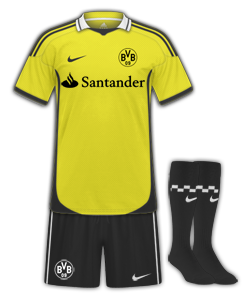
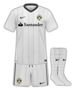
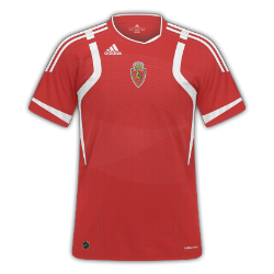
Real Zaragoza
H|A|T
H|A|T
Last edited:
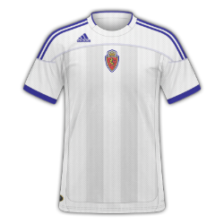
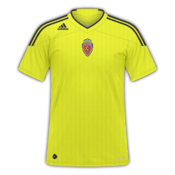
Really like those Zaragoza kits, especially the home and third.
Here are two templates I have made, but I can't think of teams they would suit. Suggestions would be helpful.


") good work so far
good work so fari really like this one
very creativeshrink the emirates logo and the arsenal badge, put the badge under the texture layer, other than that can't really fault it.. 7/10
also like dunc said save in png, it's so much better, plus no annoying white backgrounds
---------- post added at 12:15 am ---------- previous post was yesterday at 10:02 pm ----------
calum told me to post this and apparently is 'worthy of a 10'... So what do you guys think?

fc porto - nickname 'the dragons'")
Thanks for the feedback.
I'll try them on FB and see how they look. And the second one isn't quite finished I was just concentrating on the collar.
Home and Away Melbourne Victory fantasy kits, what do you think?
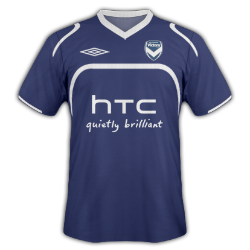
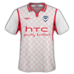
- 7/10 Home and 9/10 Away.

Got a bit excited with the pen tool on the Home kit ..any little hints or tips on neatening things up would be appreciated
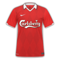
It is nice, but I think it would look better if the pattern was on a bit of a smaller scale. I have recently done some similar kits for the FBKits Shorts and Socks Style for FC Twente which sort of explain what I mean:Rates on this?
I havent added a logo because its for a fantasy team, and the logo hasnt been made yet