WIP Logo Style

What style do you like best?


  • Total voters
    14
  • Poll closed .

Tharros

Member
Joined
Nov 9, 2009
Messages
2,642
Reaction score
0
Points
0
I have just put a poll up. Which mix of styles do you think will look the best?
I have only done these two styles for reference, but you can imagine the other two possibilities (Four round edges with club colours/two round edges with country flag).

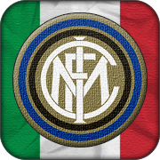
Four curved edges with country flags
barca-3.png
manu-2.png
inter-2.png
bayern-3.png


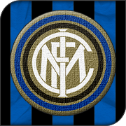
Two curved edges with club colours
barca-4.png
manu-3.png
inter-3.png
bayern-4.png


These ones will obviously take much longer to make since I have to make the backing for each club, where as with the flags, it is obviously the same for that whole country.

Comments? Criticism? Should I start making some league packs?

I was going for a sort of embroidered look.
 
Last edited:
They are different, but I quite like them. What do they look like when they are smaller?
 
I was going for different. I did not want to make another cliche set of glossy logos ;)
The size they will appear in game depends on the skin you are using and then the game resizes them. The ones in the OP are 180x180. These are 100x100:

barca100-1.png
manu100.png
inter100.png
bayern100.png
 
Last edited:
I dont use these things but they look good to me, Id probably prefer a smooth version (as in without the wrincles)
 
I dont use these things but they look good to me, Id probably prefer a smooth version (as in without the wrincles)
So you don't like the wrinkles in the flags in the background? Or the texture on the club logos? I can always reduce the effect.
 
So you don't like the wrinkles in the flags in the background? Or the texture on the club logos? I can always reduce the effect.


Mainly the wrincles mate, I just prefer a crisp effect. They do look nice, just my preference really :)
 
Looks good, is it possible to make the background flag bit shiny?
 
They look quite good mate i usually like logos with flags in the back so when are you putting up the download :D
 
Looks good, is it possible to make the background flag bit shiny?
IDK if that is the effect I'm going for. The idea was an embroidered kind of look on a flag. There are enough shiny logos around already :p
I will play with it though. See if I find something I like :)

I think I will keep the wrinkles, I will just make it less obvious.

They look quite good mate i usually like logos with flags in the back so when are you putting up the download :D
It just an Idea ATM. If it looks like there is going to be enough interest, I will make them :)
 
Last edited:
Nice work Tharros, I really like the ones in the Op with the wrinkles.(sorry Joe:p)
 
Well, I might start making the English logos tomorrow (if I have time), and I will see how it goes from there.
 
Looks good, but how do they work at icon size? Could imagine it gets a bit hard to distinguish between them when so small.
 
Well, the smallest ones (that aren't used in league tables) are 70x70 in the default SI skins, and the ones in post 5 are 100x100, so that should give you an idea. They look fine to me in game. I'm still tweaking though.
 
I think it would be nice to see a waving flag in the background with the clubs logo over laid? I think that would give better effect than the 'sandpaper' tecture currently used.
 
I think it would be nice to see a waving flag in the background with the clubs logo over laid? I think that would give better effect than the 'sandpaper' tecture currently used.
I don't think the game allows logos to be animated. Even if it did, I wouldn't know how to do it :p
 
Last edited:
Top