You are using an out of date browser. It may not display this or other websites correctly.
You should upgrade or use an alternative browser.
You should upgrade or use an alternative browser.
The 'Rate My Kit' Thread
- Thread starter Jake
- Start date
- Replies 4K
- Views 1M
- Status
- Not open for further replies.
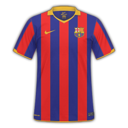
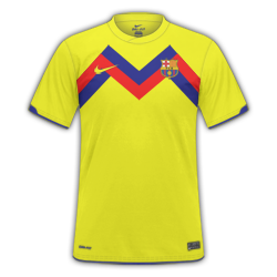
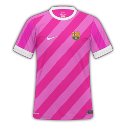
I'm really bored so I made some fantasy barca kits think there no bad to be honest
home:
away:
third:
---------- Post added at 02:41 PM ---------- Previous post was at 02:35 PM ----------

---------- Post added at 02:43 PM ---------- Previous post was at 02:41 PM ----------
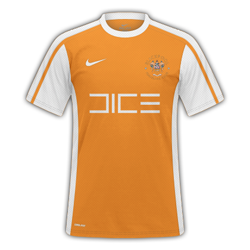
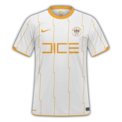
Some old Blackpool kits I found what do you think
Home:
Away:
home:

away:

third:

---------- Post added at 02:41 PM ---------- Previous post was at 02:35 PM ----------
Only thing I can really fault is the sponser should maybe be up a tad but just personal opinionChelsea H/A/T


Went for a classic home, modern away, and the usual wierd but kinda' cool third.
---------- Post added at 02:43 PM ---------- Previous post was at 02:41 PM ----------
Some old Blackpool kits I found what do you think
Home:

Away:

Chokopop
Self-diagnosed FM addict
- Joined
- Mar 10, 2011
- Messages
- 4,120
- Reaction score
- 44
- Points
- 48
Found some Bolton kits i made ages ago. Some Rates would be appreciated:
H/A
View attachment 163827View attachment 163828
H/A
View attachment 163827View attachment 163828
pistolped7
Member
- Joined
- Aug 2, 2009
- Messages
- 2,565
- Reaction score
- 0
- Points
- 0
FC Porto
H|A|T
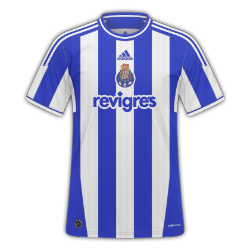
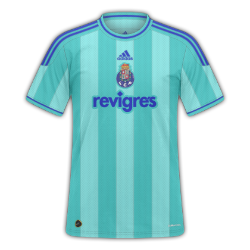
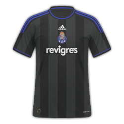
And a wee Flamengo one I made ages ago
Flamengo
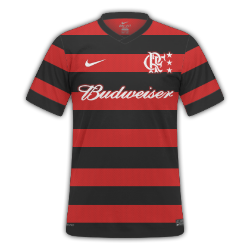
H|A|T


And a wee Flamengo one I made ages ago
Flamengo

cooper123456
Member
- Joined
- Jun 24, 2010
- Messages
- 694
- Reaction score
- 0
- Points
- 0
i love them porto ones 9/10
Love that Porto away kit.
And ajr18, the designs are nice and suit Derby. But you should add a shadow to the inside of the collar as the home looks as if it doesn't have a collar. Also on the home, the badge doesn't look right so high up.
And ajr18, the designs are nice and suit Derby. But you should add a shadow to the inside of the collar as the home looks as if it doesn't have a collar. Also on the home, the badge doesn't look right so high up.
pistolped7
Member
- Joined
- Aug 2, 2009
- Messages
- 2,565
- Reaction score
- 0
- Points
- 0
Cheers guys. Any thoughts on the Flamengo one?
cooper123456
Member
- Joined
- Jun 24, 2010
- Messages
- 694
- Reaction score
- 0
- Points
- 0
its simple yet affective 7/10
Chokopop
Self-diagnosed FM addict
- Joined
- Mar 10, 2011
- Messages
- 4,120
- Reaction score
- 44
- Points
- 48
Made a Panathinaikos kit. Used the pen tool on the end of the sleeves (I am practicing with the pen tool). The socks look a bit naked, because i have no idea how to put anything on the socks. Anyways here it is . Any thoughts`?
View attachment 163850
View attachment 163850
cooper123456
Member
- Joined
- Jun 24, 2010
- Messages
- 694
- Reaction score
- 0
- Points
- 0
here are some mancherster united kits and some everton kits rates welcome
MANCHESTER UNITED
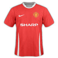
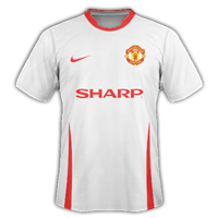
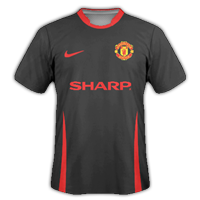
EVERTON
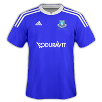
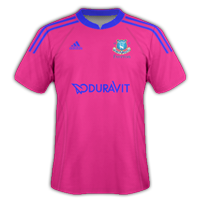
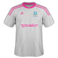
MANCHESTER UNITED


EVERTON


pistolped7
Member
- Joined
- Aug 2, 2009
- Messages
- 2,565
- Reaction score
- 0
- Points
- 0
Made a Panathinaikos kit. Used the pen tool on the end of the sleeves (I am practicing with the pen tool). The socks look a bit naked, because i have no idea how to put anything on the socks. Anyways here it is . Any thoughts`?
View attachment 163850
Really nice, maybe you could recolour the sponsor though. 8/10.
The flamengo badge looks like a Rangers badge when I look at itbut 8/10
It does a little bit, doesn't it?
cooper123456
Member
- Joined
- Jun 24, 2010
- Messages
- 694
- Reaction score
- 0
- Points
- 0
was just wondering what every one thinks of these and which set they think are better
SET 1
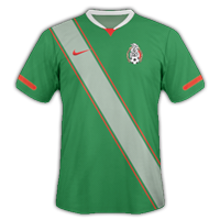
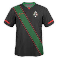
SET 2
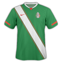
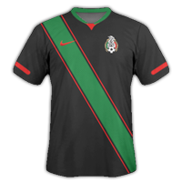
SET 1


SET 2


cooper123456
Member
- Joined
- Jun 24, 2010
- Messages
- 694
- Reaction score
- 0
- Points
- 0
hmm thats what i thought i think its maybe cus the colours on the stripe are a tad clearer :/
cooper123456
Member
- Joined
- Jun 24, 2010
- Messages
- 694
- Reaction score
- 0
- Points
- 0
i like them barcelona kits jake there simple yet very very effective 8.5/10
Rates?
- Status
- Not open for further replies.


