sidgurung97
Member
- Joined
- Dec 2, 2010
- Messages
- 1,482
- Reaction score
- 0
- Points
- 0
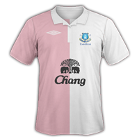
Werder Bremen H/A


They look brilliant mate, the home 10/10, however I don't like the yellow on the away.. so 8/10 for that.
Werder Bremen H/A
thanks mate there a replica of there kits this season
 9/10
9/10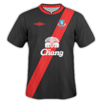
")
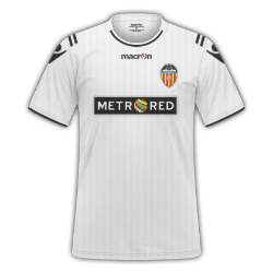
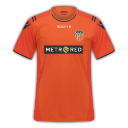
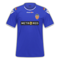
Valencia
H|A|T
Thoughts?
This may actually sound retarded, but my favourite part of the kit is the curved line beneath the collar XD
9/10, very high 9/10 (love orange and black, don't know why) and 8/10. KIU
I'm the same, I think the wee curved line looks pretty awesome, along with the shoulder stripes.
Cheers for the rates, and I love orange and black too! :wub:
Did you by any chance make the template/design yourself? It's kinda nice for Macron
I made it for Mallorca's real shirts. Fits Valencia well, great kits pistol.
Love these. 10/10
 Thoughts?
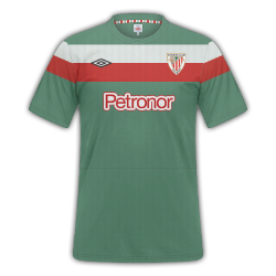
 [/COLOR]The new Athletic Club (Bilbao) away top as found HERE
Athletic Club
I know the sleeves are a wee bit funky, but I think it's pretty good
It's good, think the green and red could have been a touch lighter, and the sleeves look a bit messed up, good try nontheless. 7/10.
Nice attempt, but the chest lines look a little too straight IMO. I imagine the sleeves would be hard, as I can't picture what they would look like with the arms up like in the FB template.