You are using an out of date browser. It may not display this or other websites correctly.
You should upgrade or use an alternative browser.
You should upgrade or use an alternative browser.
The 'Rate My Kit' Thread
- Thread starter Jake
- Start date
- Replies 4K
- Views 1M
- Status
- Not open for further replies.
Mike
Like a glove!
- Joined
- Feb 5, 2009
- Messages
- 8,121
- Reaction score
- 3
- Points
- 38
Black doesn't go with Chelsea blue I'm afraid :S the sponsor is a little too large, and the watermark in the bottom right corner would look better if the colour was removed. 5/10.
Chokopop
Self-diagnosed FM addict
- Joined
- Mar 10, 2011
- Messages
- 4,119
- Reaction score
- 43
- Points
- 48
Black doesn't go with Chelsea blue I'm afraid :S the sponsor is a little too large, and the watermark in the bottom right corner would look better if the colour was removed. 5/10.
Yeah just realised i uploaded the wrong one (with the black stripes) . But at least i know where to improve.. Thanks.


peskybendben
Member
- Joined
- May 23, 2010
- Messages
- 987
- Reaction score
- 0
- Points
- 0
Liverpool:


Manchester United:


Manchester United:
Chokopop
Self-diagnosed FM addict
- Joined
- Mar 10, 2011
- Messages
- 4,119
- Reaction score
- 43
- Points
- 48
Chokopop
Self-diagnosed FM addict
- Joined
- Mar 10, 2011
- Messages
- 4,119
- Reaction score
- 43
- Points
- 48
First kits ever using photoshop.
Fantasy Mainz 05 H/A


Comments and Rates please!
Well.. You're better than i was when i first started using Photoshop

Would give 'em 8/10
Well.. You're better than i was when i first started using Photoshop
Would give 'em 8/10
Thanks for the positive feedback
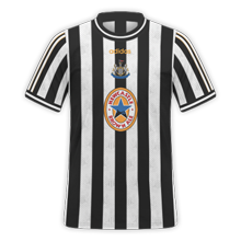
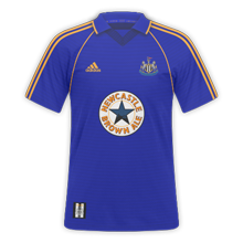
I had that both kits with 'Shearer 9' on the back. Very good work Cal. just need resizing to 250x250")
Thanks, I had the home as a kid, but with Sear 9 (people thought I'd misspelled Shearer..), don't think I had that away though. Why are people using 250*250 now though? Aren't the FB-kit packs 220*220?
250x250 for this thread, as otherwise they are too big
Ah didn't notice the first post had changed, will change them now
Chokopop
Self-diagnosed FM addict
- Joined
- Mar 10, 2011
- Messages
- 4,119
- Reaction score
- 43
- Points
- 48
What would you rate this kit? Have put alot more effort in it than i usually do :
View attachment 163990
View attachment 163990
New York Cosmos H/A
Rates??
What would you rate this kit? Have put alot more effort in it than i usually do :
View attachment 163990
The Chelsea badge needs lifting a few pixels so it is in line with the Nike logo, and the sponsor needs lifting too. I don't like the white sleeves, as I always imagine Chelsea in Blue, with white trims etc. Also, there is a white outline on the lion. Shorts & Socks are good though.
6/10, although make those changes and it's a 9
---------- Post added at 11:56 PM ---------- Previous post was at 11:55 PM ----------
Rates??
Love them, retro yet modern, and I love the Cosmos too.
9/10
---------- Post added at 11:58 PM ---------- Previous post was at 11:56 PM ----------
Liverpool:
Manchester United:
Love the Liverpool H/A, not sure about the away though, don't like the pattern.
ManUre - Home very nice, simple & effective, Away maybe a white 1/2px stroke around M&S, third I like, cannot see the badge much though.
Like this a lot, but logo is slightly too big, and needs lining up with the Umbro, and Sponsor needs lifting.
- Status
- Not open for further replies.