J
jmoser
Guest
I believe I might have made that template... In which case I will take credit for the other 999999...993/10 ")
I believe I might have made that template... In which case I will take credit for the other 999999...993/10

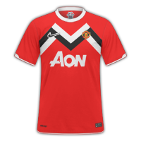
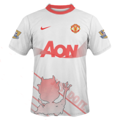
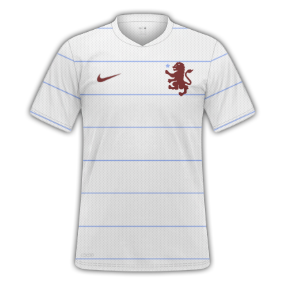
thanks for the comment. I put the Nike tick in the bottom left because it didn't look right, with the crest centred, in its normal position.Home-6
Away-7
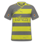
3rd-7
Your logos and sponsors are the right size, which is good, but why is the Nike tick on the bottom left of the shirt?oO)
The only thing you need to change is the inside of your collars. They should be the same colour as the rest of the kit.
")
What do you think of these ? please rate and give feedback
Not too shabby. Getting better! The home isn't too bad, I'd give a 6, not keen on the away but I think that's personal atste more than anything, but the design og the Villarreal is awesome! I'd be prod of that deisgn, but I'm not keen on having the V'real logo on the sleeves, Otherwise, 8.
I like my away one the most but as you said personal taste, and the V'real I agree with the badge on the sleeves I just wanted to try something different, do you think with the Utd away one if I got rid of the devil it would look better ?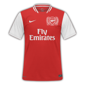
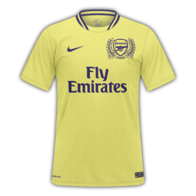
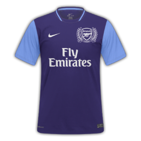
Arsenal - 8, 4, 7
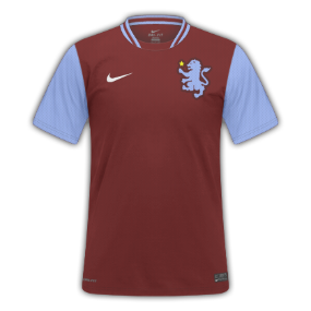
Aston Villa - 7, 7, 9
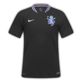
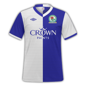
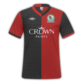
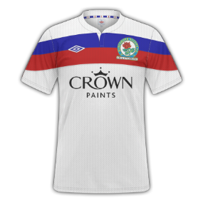
Blackburn - 9.5, 9.5, 10

What's wrong with the Arsenal away?
yellow's not dark enough imosorry i just dont like it
Oh. Thought I'd managed to get it as well. Supposed to be like the older 70s kinda ones.
Oh. Thought I'd managed to get it as well. Supposed to be like the older 70s kinda ones.
