You are using an out of date browser. It may not display this or other websites correctly.
You should upgrade or use an alternative browser.
You should upgrade or use an alternative browser.
The 'Rate My Kit' Thread
- Thread starter Jake
- Start date
- Replies 4K
- Views 1M
- Status
- Not open for further replies.


Not being funny, but what is the point in this thread, when most people post in the original thread ??? (A)
It needs closing, as this is for FM11, and the other is for FM10.
Some kits ive just done


http://img181.imageshack.us/i/fantasywalsallaway.png/
Uploaded with ImageShack.us


Uploaded with ImageShack.us
http://img560.imageshack.us/i/intermilanaway.png/
Uploaded with ImageShack.us
Rate and comment please


http://img181.imageshack.us/i/fantasywalsallaway.png/
Uploaded with ImageShack.us


Uploaded with ImageShack.us
http://img560.imageshack.us/i/intermilanaway.png/
Uploaded with ImageShack.us
Rate and comment please
dannyfiveo
Member
- Joined
- Mar 2, 2009
- Messages
- 819
- Reaction score
- 0
- Points
- 0
Pretty good, like the second Walsall one
Some Leicester ones for a request
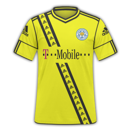
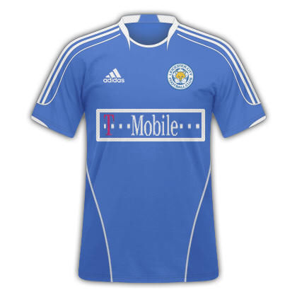
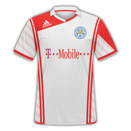
Some Leicester ones for a request
Very nice as usual danny. Although I'm not to sure about the repeated Addidas logos in the first one. I think it would look better without them and just have the two lines. One other thing, the T-Mobile logo looks rather jagged.
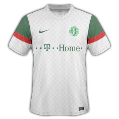
Ferencváros Home
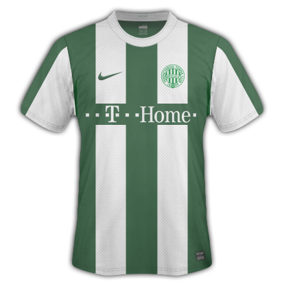
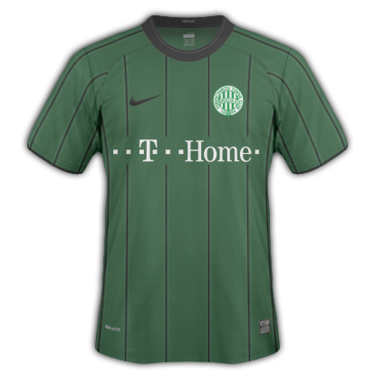
Ferencváros Away
Ferencváros Home
Ferencváros Away
Kristian60
Member
- Joined
- Nov 20, 2010
- Messages
- 21
- Reaction score
- 0
- Points
- 0


Sampadoria inspired homekit, pretty pleased with that
Bordeaux inspired second kit, kinda like it
Lakers inspired third kit. not too pleased.
would love some critics
Can people stop just posting kits without leaving feedback for other people. This is the 'RATE my kit thread', not the 'Spam your kits thread.' ")
This happened a lot in last years thread, and to be honest, the thread may as well not exist if people aren't going to use it for its intended purpose.
Perhaps there should be some sort of rules, like you have to rate the kits above you or something... IDK
This happened a lot in last years thread, and to be honest, the thread may as well not exist if people aren't going to use it for its intended purpose.
Perhaps there should be some sort of rules, like you have to rate the kits above you or something... IDK
Last edited:
dannyfiveo
Member
- Joined
- Mar 2, 2009
- Messages
- 819
- Reaction score
- 0
- Points
- 0
Very nice as usual danny. Although I'm not to sure about the repeated Addidas logos in the first one. I think it would look better without them and just have the two lines. One other thing, the T-Mobile logo looks rather jagged.
Ferencváros Home
Ferencváros Away
Thanks for the feedback Tharros, I tried something different with the adidas logo's but yeah you're right on the sponsor does look a little rough on the edges.. As for yours there nice and neat, good colour combination can't fault them really
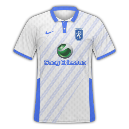
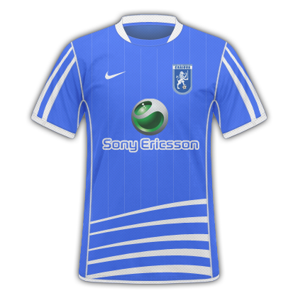
@ oneunited - The Colors look pretty good, but the logos aren't in the right places IMO. The United logo needs a nudge to the left and up a bit. Similarly, the Facebook text needs to be a little higher - a good measure is the middle (or the top depending on how high it is) of the logo should be about inline with the underarm part of the sleeve - look at my kits if you don't know what I mean.
@ Kristian60 - Very nice. Although, on the home kit, the red and black band doesn't look like it is going all the way to the edges of the shirt.
I decided to do a Ferencváros Third
@ Kristian60 - Very nice. Although, on the home kit, the red and black band doesn't look like it is going all the way to the edges of the shirt.
I decided to do a Ferencváros Third
Last edited:
dannyfiveo
Member
- Joined
- Mar 2, 2009
- Messages
- 819
- Reaction score
- 0
- Points
- 0
I decided to do a Ferencváros Third
Another very neat and effective kit, I'm struggling to find anything wrong with your kits to be honest
Couple of requests
Kristian60
Member
- Joined
- Nov 20, 2010
- Messages
- 21
- Reaction score
- 0
- Points
- 0
Another very neat and effective kit, I'm struggling to find anything wrong with your kits to be honest
Couple of request'
looking good, but the the way the blue stripes are extended to the sleeve make the kit look a bit 'flat'. you should consider keeping the stripes on the torso.
nelsonBcFc
Member
- Joined
- Mar 28, 2010
- Messages
- 261
- Reaction score
- 0
- Points
- 0
Thought I'd share everyone my 1st kit, I know it's bad but this is my 1st time using photoshop. When I have more time I will look at the tutorial's.
How are people getting the strips. are they a template?
View attachment 114242
How are people getting the strips. are they a template?
View attachment 114242
PHP:
Edit: Sorry about the picture, in a rush, I will figure out how to upload later. My computer is being a ****
Last edited:
Kristian60
Member
- Joined
- Nov 20, 2010
- Messages
- 21
- Reaction score
- 0
- Points
- 0
very simple, very effective, very neat. only thing is, i fell its missing a little white white trim. cant really put a finger on where, tho.
revisied my pro vercelli kits


XCII is the roman numerals for 92, pro vercelli was founded in 1892
I don't really like the pattern on the away kit. I breaks my eyes! 
Also I think the XCII is a little too high up the shirt on the third. I makes the top of the shirt look a bit cramped. Otherwise very nice.
As for my third kit, I don't know about putting more white in it. Limiting it to the sponsor makes it stand out.
Also I think the XCII is a little too high up the shirt on the third. I makes the top of the shirt look a bit cramped. Otherwise very nice.
As for my third kit, I don't know about putting more white in it. Limiting it to the sponsor makes it stand out.
Last edited:
XCII is the roman numerals for 92, pro vercelli was founded in 1892[/QUOTE]
Really like this kit. not too sure about the size of the badge though
............................................................................................................................................
Ive done some kits. not my best work, probably my worst actually but i wanted to do something different so i used errea kits as ive never used them before.I dont expect anyone to like these

Uploaded with ImageShack.us

Uploaded with ImageShack.us
Oh just relised i dint change the logo colour but cba to change it now
Kristian60
Member
- Joined
- Nov 20, 2010
- Messages
- 21
- Reaction score
- 0
- Points
- 0
Ive done some kits. not my best work, probably my worst actually but i wanted to do something different so i used errea kits as ive never used them before.I dont expect anyone to like these)
Thanks for the input,
i think the logo collides with the shirt design on both shirts, other than that, very nice
- Status
- Not open for further replies.