You are using an out of date browser. It may not display this or other websites correctly.
You should upgrade or use an alternative browser.
You should upgrade or use an alternative browser.
The 'Rate My Kit' Thread
- Thread starter Jake
- Start date
- Replies 4K
- Views 1M
- Status
- Not open for further replies.
T
TheMjt
Guest
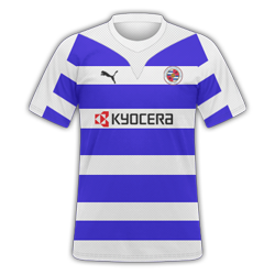
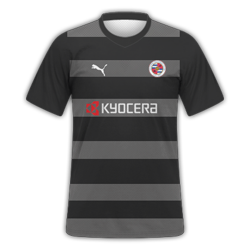
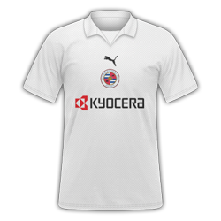
Reading Home, away & third for request
T
TheMjt
Guest
Thanks for rating the one above like you're supposed to mate [/sarcasm]
8/10, now rate mine as asked
8/10, now rate mine as asked
Reading Home, away & third for request
 Two requests on a danny's thread
@ the Mjt nice kits 9 out of 10
@ JK i dont like the home the away is better i think 6 for home 7.5 for away
Made a newcastle kit, see what you think.
The sponser seems a bit too much fr me, personally I would go for just the golden arches, makes the kit seem a little cleaner, everyone knows that the golden arches are mcdonalds anyway, otherwise decent work.
Dont like sponsor but 6-7/10
Roma Kit for My kit pack
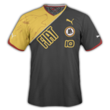
looks quite good
7/10
My first kit on the FB Style
http://i54.tinypic.com/2rqj8na.png
PLEASE READ RULES REGARDING IMAGE SIZE
http://i54.tinypic.com/2rqj8na.png
PLEASE READ RULES REGARDING IMAGE SIZE
Last edited by a moderator:
brianpullen
Member
- Joined
- May 26, 2010
- Messages
- 383
- Reaction score
- 0
- Points
- 0
Eeesh them sleaves hurt my eyes! i like the body though, badge looks a tad squashed but the simplicity works well ")
5 (because of the sleeves)
5 (because of the sleeves)
Nice simple Germany home kit,

Nice, except sort the badge out!
Just scale to 10:10 and see how it looks and adjust like that rather than manually resizing
My away Reading Kit
I really like that nice design, 9/10
My away Reading Kit
Very nice design.
imo the badges are too large
7/10
Is this any better

No...
Copy and paste the logo into photoshop, then go to Edit > Transform > Scale. Then go to the top of the page and change the W(idth) and H(eight) to 10:10 or whatever looks right, rather than manually resizing. The badge is squashed.
- Status
- Not open for further replies.