The 'Rate My Kit' Thread

  • Thread starter Thread starter Jake
  • Start date Start date
  • Replies Replies 4K
  • Views Views 1M
Status
Not open for further replies.
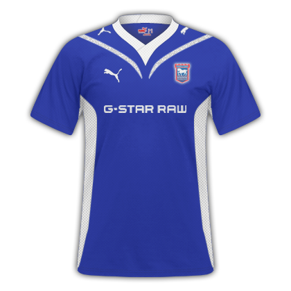
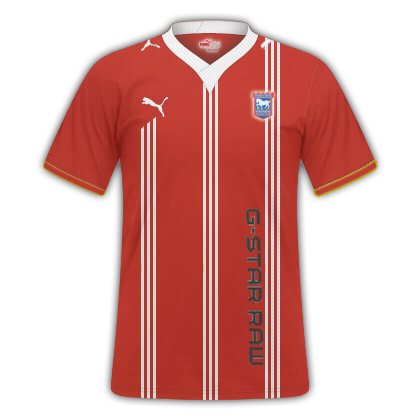
An Ipswich Home and Away kit I am entering for a KOTW competition

ipswichhome.png
ipswichaway-1.png


Please rate :)

First one is pretty good, might want to make the badge and sponsor a little bigger and change the colour of the puma logo on the back of the shirt to white or something.

Second one - Sponsor should probably be white, if anything just to avoid having white edges as it's a difficult sponsor to cut properly. Again the puma logo on the back of the collar needs a colour change and the sponsor should be moved higher up. Finally the badge should be a little bigger.

7/10 overall =)

---------- Post added at 03:53 PM ---------- Previous post was at 03:47 PM ----------

Chelsea Away

chelseaaway250.png

Al-Ahly Away
alahly250.png


Can't fault the first one tbh, very nice kit.

Second one looks odd with the red sponsor. Try and blend the badge into the shirt so make it gold - I don't know how to do it, but something like this:

rubinkazanaway.png


rubinkazanhomem.png


Then make sponsor gold too and remove the colour overlay on the logo on the bottom right. (Drifit or whatever it is)
 
Thanks Joss, ever the critic lol :P

lol, sorry. It looks like I've written loads of stuff that's wrong, actually it's just a few things and they'd be really nice! I just remember what people tell me when I post kits...
 
Yeah, I was actually delighted with the kits, must have spent an hour on the away kit last night and it looked better with black sponsor ;)

Also, the emblem on the inside, if I changed the colour, the details of the PUMA lion would not stay as defined so I leftthem how they were :)

What do you think of the pattern on the archs of the Home kit?

Yeah, really like the Home kit, was just a couple of small things.
 
Can't fault the first one tbh, very nice kit.

Second one looks odd with the red sponsor. Try and blend the badge into the shirt so make it gold - I don't know how to do it, but something like this:

rubinkazanaway.png


rubinkazanhomem.png


Then make sponsor gold too and remove the colour overlay on the logo on the bottom right. (Drifit or whatever it is)

Thanks mate!Really apreciated!
Tbh havent thought abou that,good idea!Will give it a go and post it latter on ;)
 
Not a bad design. But imo far to bright on the home kit !

7/10 - Home
8/10 - Away
 
What browser are you using mate ?

Works fine on Chrome :D
 
I can't either and I'm on Chrome.
 
Status
Not open for further replies.
Back
Top