The 'Rate my Photoshop work' Thread

  • Thread starter Thread starter Max
  • Start date Start date
  • Replies Replies 1K
  • Views Views 345K
289jwpt.png


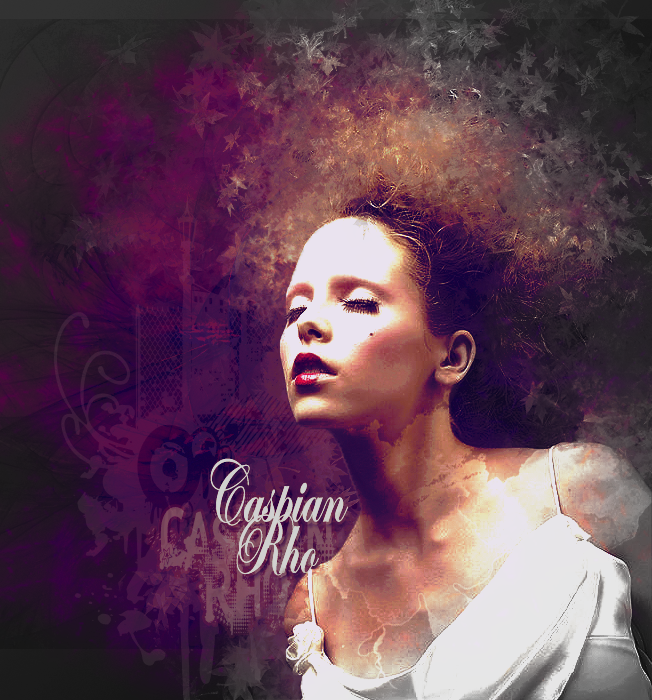
This is the last thing I made recently =P


there's a nice design element in this, although not flowing and is a tad unbalanced... lighting needs work too,,,
 
Here's my latest sig
(only my third bear in mind)
:P

martin skrtel of Liverpool
:)

skrtel.png


rate and leave feedback as always!
:]
 
Another Slash pic. Just messing around with the layer styles again and adding some plasma looking effect brushes with an outer glow.
Original picture included.

EDIT. If anyone wants the plasma effect brushes they can be found here.

http://r0man.de/free_photoshop_brushes.html
 
Last edited:
Another Slash pic. Just messing around with the layer styles again and adding some plasma looking effect brushes with an outer glow.
Original picture included.

wow.... just WOW


made these for Kylos Schlake story:

fazio.png

assistantmanager.png

podolski.png
 
Last edited:
Ooh, scary! Thought I'd drop these in.

354_Untitled_5.png

153_Untitled_1.png

172_Untitled_2.png

733_Untitled_2.jpg


i don't have time to discuss these individually, although I will say way too busy and little use of negative space. Some nice text but you really need to compact the design a bit more. Like I said if there's space you don't necessarily need to fill it. Find a focal point for your tags and work everything off that or imagine how things react and interact with your focal point.

Most mistakes generally centre around poor design and flow, just like football get your team playin then work on the technical side (H)
 
Robben & Bastos sigs:

bastos.png


robben.png


feedback and constructive criticism welcome
:}
 
I gather from this I need to improve <)

you need to scale these which is in EDIT>>>TRANSFORM>>>SCALE

and maybe blend the necks in and maybe cut those heads out a little bit better!
 
Last edited:
ima gonna post this W.I.P and comment on yours later Jose, but defo heading the right direction!

anyway this is what I'm currently working on

naturallarge-piece.png


---------- Post added at 05:54 PM ---------- Previous post was at 05:50 PM ----------

two sigs i experimented with :)

improvements?

kellysmith.png

worldcup2.png


what's the font in the second one please?
 
ima gonna post this W.I.P and comment on yours later Jose, but defo heading the right direction!

anyway this is what I'm currently working on

naturallarge-piece.png


---------- Post added at 05:54 PM ---------- Previous post was at 05:50 PM ----------


what's the font in the second one please?


erm bleeding cowboy i think that was.... from dafont :)


oh and your work in progress... just wow :)
i doubt ill ever be as good at this photoshop stuff as you xD
 
Something I just made a moment ago
dzxlcw.jpg

Bear in mind I've been doing photoshop for only 2 months now.
Criticise away :)
 
my first attempt's at kit's there ok i guess.
I like the villa home one though.
feedback please :)
astonvillahome.png

Aston villa home
astonvillaaway.png

Aston villa away
sheffieldunitedaway.png

Sheffield united away
 
Back
Top