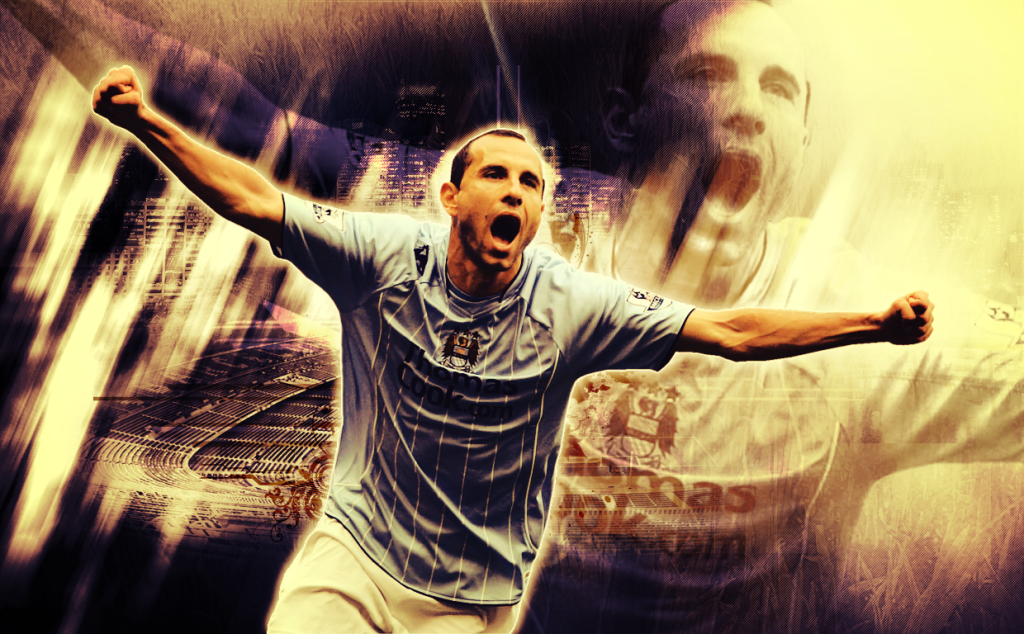
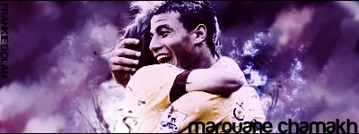
Nice, very good blending in but imo the blue doesn't really suit the kit. Text doesn't look great, like the blending Milan badge aswell.
9/10

V2 better or worse?
Much better mate, text looks a bit better aswell.
Seems that some of you guys know how to create one **** of a signature. Does anyone know a good Paint.net signature tutorial?
Forget paint and try to get hold of photoshop. Even one of the earlier editions are far better than paint.
I don't want to **** on your fireworks but, why is Camp Nou in the background?Some of mine works:
<---------My avatar


another one!
