The 'Rate my Photoshop work' Thread

  • Thread starter Thread starter Max
  • Start date Start date
  • Replies Replies 1K
  • Views Views 345K
rubbish ino

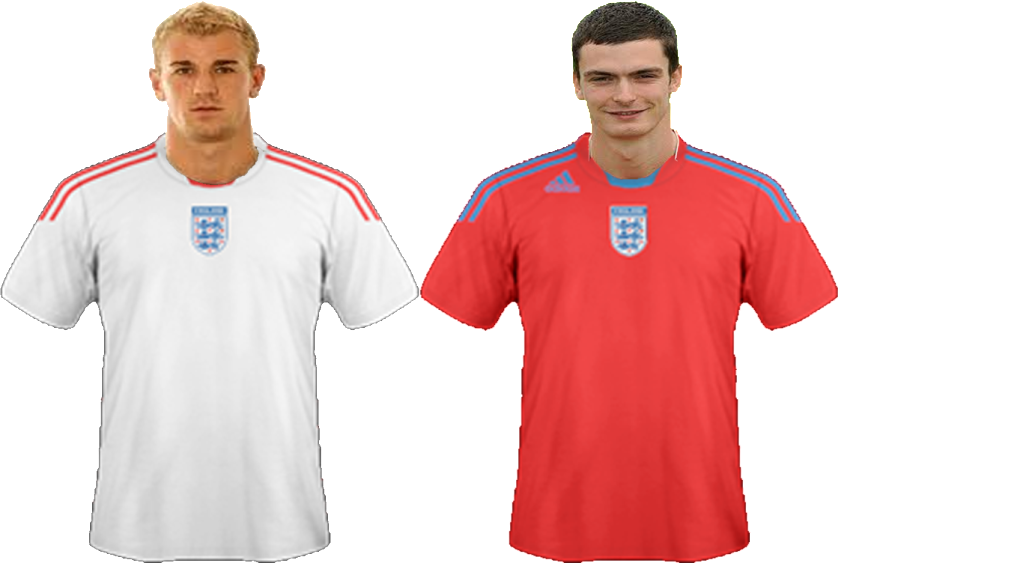
Untitled-englandshow.png

Err those doesn't look right :S
 
Something i just put together. Please rate and comment it :)

I really like this and your style. 9/10

---------- Post added at 11:37 AM ---------- Previous post was at 11:33 AM ----------

Not been making many of late. Van Der Vaart

 
I really like this and your style. 9/10

Thank you very much :) I Like your VdV aswell :)

---------- Post added at 01:57 PM ---------- Previous post was at 01:22 PM ----------

I found this in my old data. It's kinda old but thought i'd post it anyway :)
essiensigcopy.png
 
Decent render, 8/10

Try to give more detail in the hair and remove the black lines by going to Layer - Matting - Defringe at 1.
 
almunia render
View attachment 110084

Im considering opening a request thread do you guys think im good enough or do i need more practise?

Its a good way of practising as the more you do the better you will get. Check out tutorials as well as they give you an idea on how to blend in renders other effects.
 
'We Are The Ocean' inspired sig:

wato.png


comments/ratings?
 
I'm getting Photoshop again tonight/tomorrow, so I'll be making signatures again :) I'll post some stuff in here when I've done it.
 
not my best work but i was messing about trying new things:
dossantos.png


comments/ratings please :)
 
I'm getting Photoshop again tonight/tomorrow, so I'll be making signatures again :) I'll post some stuff in here when I've done it.

Look forward to it Danny. If I remember you were pretty good at them.
 
not my best work but i was messing about trying new things:
dossantos.png


comments/ratings please :)

From my past experience in sig-making, I think one of the main rules is NOT to cover your focal point with Effects-Brushes-Whatever. Plus, you have 2 renders in your sig, and that has never worked for me. At least try to hide it a bit more. About text, I think we all know it is the hardest part of sig-making, but that one just isn't working, it takes the attention of the eyes from the 'focal' point (should be Gio, but I can't even see if that is his face), first off, it's too big. Second, you messed up with the 2 types of text you got there, try something more subtle. About the background, it's not bad at all, but, again, is way too messy, as I have no idea of what I'm looking at.

3/10

Sorry if I seem too harsh, but wandering thru this thread, I've seen a **** of a better work from you. Don't give up, make another sig based on Gio, and shut my big Effin' mouth :)

like i said it wasnt my best work and i was experimentng... ive taken everything on board and ive come up with these:
2 versons cause wasnt sure which one was best.

dossantosv2.png


dossantosg.png


beter?
 
like i said it wasnt my best work and i was experimentng... ive taken everything on board and ive come up with these:
2 versons cause wasnt sure which one was best.

dossantosv2.png


dossantosg.png


beter?

it's a lot better. Next thing you should have in mind would be borders/strokes. But that is, indeed, much better than the other one.

6.5 outta 10, maybe
 
Back
Top