FME Zealand Skin

FME Zealand Skin v4.00 (Hotfix)

Zealand uploaded FME Zealand Skin

Leave feedback below.
Thumbs up nothing against pink but not my cup of tea player profiles top rank when i play the game that is exactly what i want to see not computer savy so not capable of doing it myself so thank you zealand and keep up with your you tube enjoy watching your shows your a funny guy.
 
Skin looks good and is exactly what im looking for functionality wise.
 
Last edited:
Good Morning,

I have a suggestion for a slight little tweak to the skin if you are interested?

On the club profile screen is it possible to add the key player and hot prospect to this screen in the key people area?

will just save you having to click on the general screen to find that info out.

As a cheeky bonus request can you make the player face thumb nail slightly bigger along with it? I hate it when the player face thumbnails are tiny.

Keep up the good work!

Andy.

20211104091806_1.jpg
 
This is my suggestion. Ever since FM21 I've always hated the little scoreboard in the top left because it utilises the "Six Letter Names" instead of the "Short Names" of clubs. In my opinion, many of these 6 letter names are very stupid. For instance, Hoffenheim are represented as "TSG 18" (because of the club's full name being TSG 1899 Hoffenheim) which is just nonsense because no-one refers to them in that way normally. Could you make the scoreboard significantly bigger and make it use clubs' short names instead?

Love the skin overall, especially the scouting and player profiles. Wonderful stuff.
 
1636021566955.png


Hi Z, this is the only issue I have found with the skin is that the data hub colours on the charts are the same, obviously you can figure it out but just easier at a quick glance if your stats are in the main club colour. Great job and love it!
 
Great skin! Could easily become my favourite one this year.
only thing that I miss - especially given how great the player profile screen has been done - is the club info screen. that one seems a bit bland compared to other skins. I understand you want to stay close to the base skin but I feel there's a lot of useful information or immersion that could be added to that screen. I've attached an image comparing the Z-FE-skin to some other skin I have been using the last couple of days (that has it's own short comings compared to the Z-skin) just to visualize what I mean..

Skins.png
 
Hey Z, great skin! Very nice update to the functionality. The only thing I would like to be able to change is the contrast. For me the background is to dark. Even the original skin from FM is to dark for me, so until today I used kojuro´s 3.0.4 skin. Would be great to have the option to change background color.
 
This fixes a bunch of annoying stuff.

Couple tweaks I would like, show the ability/potential of the scouted players on whilst on the attributes page, one of the two areas highlighted could work.

1636024764716.png


Also, a setting to choose between a colour accent based on the club you are managing vs a set colour would be nice.
Finally, loading a save again resets any changes made to the player profile screen.
 
Anyone else having an issue with the tablet area on the match day screen, in that the tablet area will reset to half the size every time you come back from a highlight?

I am having to drag it across to make it full screen every time, but cannot figure a way of telling it to keep it that size. Its a great design but just a pain it keeps resetting.

Screenshot 2021-11-04 113629.png
 
Last edited:
Loving this skin so far, just need one more thing to make the skin perfect. Some skins I used on FM21 had widgets in the match view that remainded me of same older FM's when they had Split View.

Something like this. Would love to see that feature included in next version. When I have some big win I can screenshot only this part of the view and share on forums/Discord/Social media. It's so easy and we have all of the importatn informations on the screen.

split-view.jpg
 
1636025623492.png


I have a large monitor, so it would be awesome if there could be added a few more options in each widget, as I end up with duplicates :)

A couple of ideas, that I personally would like are the following on the Player Profile::

1. ProCon list in one of the longer widgets. I can never remember what each icon is, so I have to hover over each to see the Pros and Cons of the player. Give me a list with the descriptions.
Example from a FM21 skin (TATO21): ... that one is a bit big, but could be done smalle with just the headline for each point.
1636026125821.png


2. I like to see the player's Media Handling style on the player profile screen as well. Could it be added under Personality?


3. Traits being trained. Either show the trait being trained under his existing traits, or show it in the 'Training Widget'.

Mentoring screen:

4. List of players. Include Determination score, as well as other relevant data, as Hierarchy, Social group and Media Handling style. These are all important factors for Mentoring Units.
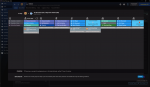
This is a work in progress list, I made for my own enjoyment in FM21. Might be useful for inspiration ;):
1636026671898.png
 
Is it normal that progressing the day and saving now appear in a smaller separate screen?

I'd also suggest adding the position of a player to the scouting screen. Because if their description is something like 'wonderkid' you can't actually see which positions they play unless you hover over the scout rating recommendation.
 

Attachments

  • progress.png
    progress.png
    254.1 KB · Views: 97
  • save.png
    save.png
    144.5 KB · Views: 90
I am using it but my tablet looks wont change? I only have two panels even though I drag and make it big?
 
Another panel/widget idea for the Player Profile:

Notes. The Notes system sucks, because it is so fiddly to update and read. But a panel/widget that shows any notes made on the player would be nice :)
 
Anyone else having an issue with the tablet area on the match day screen, in that the tablet area will reset to half the size every time you come back from a highlight?

I am having to drag it across to make it full screen every time, but cannot figure a way of telling it to keep it that size. Its a great design but just a pain it keeps resetting.

View attachment 566135
Yes, also have this issue
 
Top