The 'Rate my Kit' Thread

  • Thread starter Thread starter Max
  • Start date Start date
  • Replies Replies 3K
  • Views Views 430K
Drew every line myself using the pen tool , then warped them a little , added inner glows , outer glows for the effects , lowered the opacity , fill
Basically every design ive had to do on these templates ive had to draw myself as there is only about 8 different designs in the template unlike SS that has about 800 or so designs.

Also forgot to say Thanks very much Dunc And Jhopper89
 
Last edited:
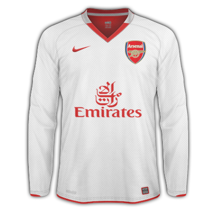
I like this one:)
arsenalthird.png
 
Last edited:
9/10 Musgrave i like that design and colour combo

I just done these 2 Brazil New home , And Holland New home , Please rate

 
Really like the Brazil one, but the colour of the Netherlands kit looks like baby food.

Make it a brighter orange perhaps.
 
Called Drawing LOL

---------- Post added at 06:29 PM ---------- Previous post was at 06:24 PM ----------

9/10 Musgrave i like that design and colour combo

I just done these 2 Brazil New home , And Holland New home , Please rate


Abs Butifull
 
Another couple of kits done Zenit ST P Home , Away Rate plz - 10/11 designs


Very nice, like the Holland kit and the Zenit kits :)
 
Ty Heres one just made sitting about
Its the Werder Bremen 111th Anniversary Home Kit Limited Edition
 
New Zealand kits, inspiration drawn from traditional Maori tattoos.

Home:
 
ye i like the new zealand ones, very much because of the thought you have put into relating the style to the culture of the country ;)
 
Newcastle Home Kit I just made Seen the design on Football culture saying its the 10/11 design so i decided to make it. Please Rate


PompyDan 9/10 love the tribal Design on the kits nice touch
 
Newcastle Home Kit I just made Seen the design on Football culture saying its the 10/11 design so i decided to make it. Please Rate


PompyDan 9/10 love the tribal Design on the kits nice touch
9/10, very nice but id get rid of the outline on the northern rock box
 
Back
Top