mattdamon1990
Brazil 2014 all the way
- Joined
- Feb 3, 2010
- Messages
- 193
- Reaction score
- 0
- Points
- 0
You need the Convert Point tool (in the pen tool submenu). Then use that, select the path you've made with the pen tool and go to a point (parked by a little square), click and drag it to bring out the curve handles, adjust these as you need. You can also move points by ctrl+dragging them.
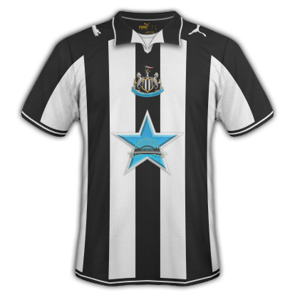
Decided to have a shot at making a shirt, not got the emblem to integrate nicely, although the retro coat of arms worked well, didn't fit in.

Put the Arsenal badge above every single layer as it is faint which normally means it is below the design of the kit. Overall 8/10Arsenal if they were in the A-League

Put the Arsenal badge above every single layer as it is faint which normally means it is below the design of the kit. Overall 8/10
How are these mate ??These are all so good!! How do you guys make them, Photoshop im guessing but where do you get the shirt template from etc.
Keep up the good work everyone!!
---------- Post added at 09:34 PM ---------- Previous post was at 09:33 PM ----------
P.S has anyone made any Cardiff kits i could pinch lol?
Cheers.