Steve*
Y.N.W.A.
- Joined
- Dec 30, 2009
- Messages
- 4,696
- Reaction score
- 4
- Points
- 38
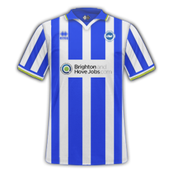
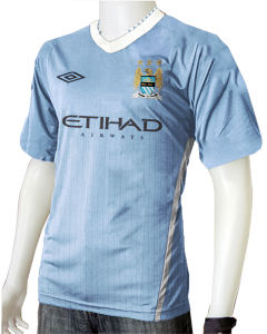
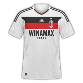
Home- 6/10 A bit bright. Brings back bad memories of Newcastle's 09/10 away kit
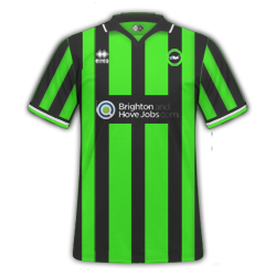
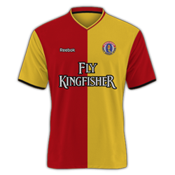
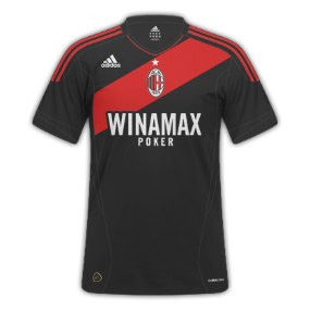
Away-7/10 Logo looks a tiny bit squished
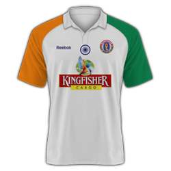
Third-8/10 Nice
Alright, not sure bout the logos on the away, look squashed.
Edited the away, look any better?
---------- Post added at 03:51 PM ---------- Previous post was at 03:47 PM ----------
View attachment 185139View attachment 185138the wednesday 1 is a special one to all the wednesday pigs around
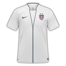
Home: 1/10
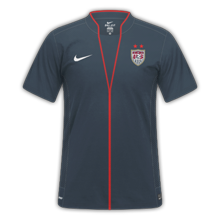
Away: 3/10
On the home the logo is actually bigger than the shirt. Logo is also much too big and isnt centered.
Away: Cant see collar line and problems with the shirt sponsor(Cant see the I and the D is meant to be hollow in the middle)
Try take more time before you class them as finished
")

 )
)