Harriers09
Member
- Joined
- Jan 5, 2009
- Messages
- 2,887
- Reaction score
- 0
- Points
- 0
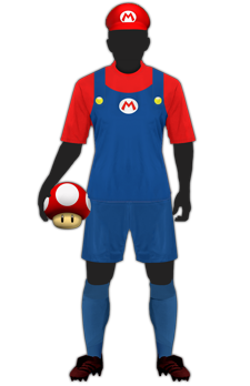
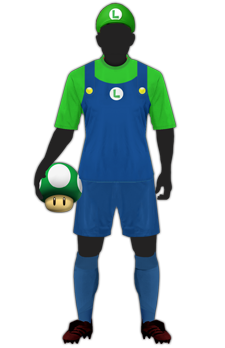
Changed the yellow Chelsea one, I prefer this one tbh:
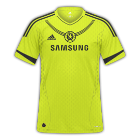
love em all mate, but this Chelsea one looks like the badge is a medallion! I think it works though
Changed the yellow Chelsea one, I prefer this one tbh:
love em all mate, but this Chelsea one looks like the badge is a medallion! I think it works though
Loving them all. Can't fault them in any way. 12/10
")
")
Those Bayern Munchen tops are amazing, 10/10.


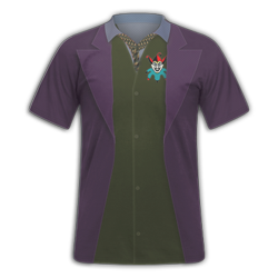
Brilliant kits Sid, .. Below I've done a couple of Portmouths kits and a super hero kit attempt
Love it! Realistic too!A trio of kits I am using with Barcelona - H/A/T


Good first attempt
Here's a little bit of constructive critisism to help you improve further:
Move your sponsors up a little bit so that they're in line with the end of the sleeves
The inside of your collar should be the same as the main colour of the kit, red in this case
my next attempt at kits after the constructive criticism
Arsenal Home:
]
Is it just me or does the colours look a bit dull?
I would get rid of the stripes near the sleeves, they seem to be a slightly different colour to the sleeve and doesnt quite look right. Would also make the sponsor a bit bigger or crest a bit smaller as they are slightly out of proportion.