The 'Rate My Kit' Thread

  • Thread starter Thread starter Jake
  • Start date Start date
  • Replies Replies 4K
  • Views Views 1M
Status
Not open for further replies.
Black samba there is a Layars button Under windows which you then have to hide aload of layars unfortunatly you cant group layars so makes thinks alot harder

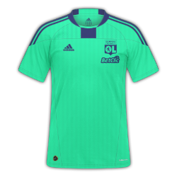
Just wondering what you guys think of this we are curently working on templates I also made this tempalte

Oscar7 made the texture
765_hgamesize.png
 
Last edited:
What is it with everyone and 'that is the wrong colour/shade'? It's a fantasy kit gallery, of course the colours aren't going to be 100% that of the teams' real colours.

whyelse, 6/10.
 
My first attempt @ Man Utd home on the new R'07 template
 
What is it with everyone and 'that is the wrong colour/shade'? It's a fantasy kit gallery, of course the colours aren't going to be 100% that of the teams' real colours.

whyelse, 6/10.


So you wouldn't say anything if someone did a manyoo kit in light blue? IMO i prefer it if people try to keep the clubs traditions with the kit they design?

---------- Post added at 10:41 PM ---------- Previous post was at 10:40 PM ----------

My next effort below AC Milan home kit. Simple but looks nicer than the ones I did before. For some reason though the image on here doesn't look as high quality as when I open it in GIMP.

http://www.fm-base.co.uk/forum/album.php?albumid=830&pictureid=7159

Thanks to whyelse for your thoughts and also the advice on the layers. Will give it a go. Any thoughts on this?
 
So you wouldn't say anything if someone did a manyoo kit in light blue? IMO i prefer it if people try to keep the clubs traditions with the kit they design

Yes but as long as its light blue for Man City or dark blue for Chelsea, it shouldn't really be a big issue.
 
The first one is fine but the second the badge is too big, also sponsors need to be higher, so 7/10 for the first and 4/10 for the second.

Brighton Home

11jp2xx.png


Brighton Away

30mlob6.png

 
Thanks! :wub:
No, they're from a while back, still without PS. :(

---------- Post added at 11:10 PM ---------- Previous post was at 11:03 PM ----------

Juve

JuveH2016-18.png
JuveT2017-18.png
JuveA2019-20.png

I really like the idea behind the third. Although I wouldn't change the colour of the badge, as on the away kit it reminds me more of the Verona badge.

Here are some Spurs kits for my brand, and the writing on the home and away is 'audere-est-facere', the club's motto.

1112h.png
1112a.png
1112t.png
 
Status
Not open for further replies.
Back
Top