The 'Rate My Kit' Thread

  • Thread starter Thread starter Jake
  • Start date Start date
  • Replies Replies 4K
  • Views Views 1M
Status
Not open for further replies.
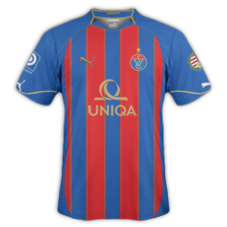
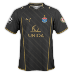
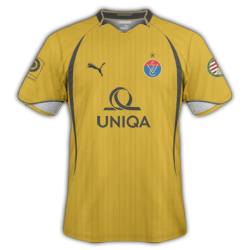
I really like the idea behind the third. Although I wouldn't change the colour of the badge, as on the away kit it reminds me more of the Verona badge.

Here are some Spurs kits for my brand, and the writing on the home and away is 'audere-est-facere', the club's motto.

1112h.png
1112a.png
1112t.png

Thanks, see what you mean there.

Really like those Spurs kits, very,very smart. H=10, A=9, T=10
 
Vasas 100th Anniversary Home
VasasHome10-11-3.png


Vasas 100th Anniversary Away
VasasAway10-11-2.png


Vasas 100th Anniversary Third
VasasThird10-11-2.png


Edit: Added a third kit
 
Last edited:
epoegm.png

My first ever attempt at a shirt!!! Thought i'd try and bring back some memories of Alan Shearer, Les Ferdinand, Faustino Asprilla, David Ginola, Philippe Albert, Rob Lee and Shay Given with the old Newcastle Brown Ale logo and the Adidas kit sponsor!!! But with a modern spin!!!
 
epoegm.png

My first ever attempt at a shirt!!! Thought i'd try and bring back some memories of Alan Shearer, Les Ferdinand, Faustino Asprilla, David Ginola, Philippe Albert, Rob Lee and Shay Given with the old Newcastle Brown Ale logo and the Adidas kit sponsor!!! But with a modern spin!!!
Very good for you first kit IMO. My only concern is I don't think the sponsor works that well. The sponsor position is good however. Other wise everything is good.
Perhaps the Newcastle logo could be a tad smaller however. I find that between a width or height (which ever is bigger to start with) of 30px-35px is best.
 
Last edited:
Very good for you first kit IMO. My only concern is I don't think the sponsor works that well. The sponsor position is good however. Other wise everything is good.
Perhaps the Newcastle logo could be a tad smaller however. I find that between a width or height (which ever is bigger to start with) of 30px-35px is best.

With the sponsor I just went for the old school Newcastle look. But yeah, it definitely does look a bit outdated. I tried the Microsoft/Windows logo which I loved the idea of but my cutting skills are not great (yet!). The Newcastle Brown Ale logo was much easier to edit. On that note, do you know of a good cutting/magic wand tutorial? For instance... Trying to get in the gaps of logos/lettering.

I will take your advice on board! Thanks dude
 
Please rate! Thanks

Chelsea Home/Away/Third
[/U]​
i really like these - only thing i dont like is position of adidas logo

also the chelsea badge on home looks a bit stuck on, now i'm no kit maker but the guys on here sometimes say something about badges not being top layer, maybe this is whats wrong

for first kits tho they are very good and people who can't make kits this good yet are popping up with kit request threads all over the place

8/10 - good job

---------- Post added at 04:52 AM ---------- Previous post was at 04:49 AM ----------


Made these for my story :) rate please, and check it out if you want, links in my sig.

Also, apologies for the size, I will rezied them tomorrow for this thread, maybe ;)
away kit is just awful but its so funny - home kit is very nice

home 8/10
away 3/10
 
Last edited by a moderator:
With the sponsor I just went for the old school Newcastle look. But yeah, it definitely does look a bit outdated. I tried the Microsoft/Windows logo which I loved the idea of but my cutting skills are not great (yet!). The Newcastle Brown Ale logo was much easier to edit. On that note, do you know of a good cutting/magic wand tutorial? For instance... Trying to get in the gaps of logos/lettering.

I will take your advice on board! Thanks dude
There are a couple of ways to do it:
1. Use the magic wand tool ;)
2. Use a mask (It should be at the bottom of the layers pane). Doing it this way as it is non-destructive. Meaning you don't actually touch the original image, you are just telling PS what parts of the image should and should not be shown.
3. Use the magic wand on the RGB channel, delete the selected area. This may reduce the opacity of the image you want, so to reverse that effect, just duplicate the layer a few times then merger it.

@Dan, csojani - I thought posted kits had to be a maximum of 250x250px? That is what mine are a few posts up, and yours are definitely bigger ;)

Edit: My bad, Dunc said he will resize his :)
 
Last edited:
@Dan, csojani, Dunc - I thought posted kits had to be a maximum of 250x250px? That is what mine are a few posts up, and yours are definitely bigger ;)

If you read my post I cover that.
 
Status
Not open for further replies.
Back
Top