You are using an out of date browser. It may not display this or other websites correctly.
You should upgrade or use an alternative browser.
You should upgrade or use an alternative browser.
The 'Rate my Photoshop work' Thread
- Thread starter Max
- Start date
- Replies 1K
- Views 393K
unknown111222
Arteta<3!
- Joined
- Jul 22, 2009
- Messages
- 1,120
- Reaction score
- 0
- Points
- 36
A couple of little sigs i knocked up
View attachment 81267
View attachment 81268
View attachment 81269
View attachment 81267
View attachment 81268
View attachment 81269
unknown111222
Arteta<3!
- Joined
- Jul 22, 2009
- Messages
- 1,120
- Reaction score
- 0
- Points
- 36
Nice sig mate. 8.5/10 (H)
A couple of little sigs i knocked up
View attachment 81267
View attachment 81268
View attachment 81269
Good work. KIU! Average rating of 8/10 (H)
hiphopahol101
Member
- Joined
- Aug 8, 2009
- Messages
- 662
- Reaction score
- 0
- Points
- 0
SwineFluGotYou
Hi There
- Joined
- Jan 10, 2010
- Messages
- 854
- Reaction score
- 0
- Points
- 0
View attachment 82593
View attachment 82594
View attachment 82595
View attachment 82596
I found these hope you like them.
View attachment 82594
View attachment 82595
View attachment 82596
I found these hope you like them.
hiphopahol101
Member
- Joined
- Aug 8, 2009
- Messages
- 662
- Reaction score
- 0
- Points
- 0
Caspian_Rho
Member
- Joined
- Jun 27, 2010
- Messages
- 116
- Reaction score
- 0
- Points
- 0
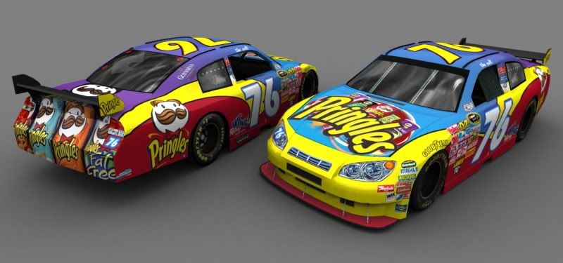
this was a nascar I done for Nascar 09:

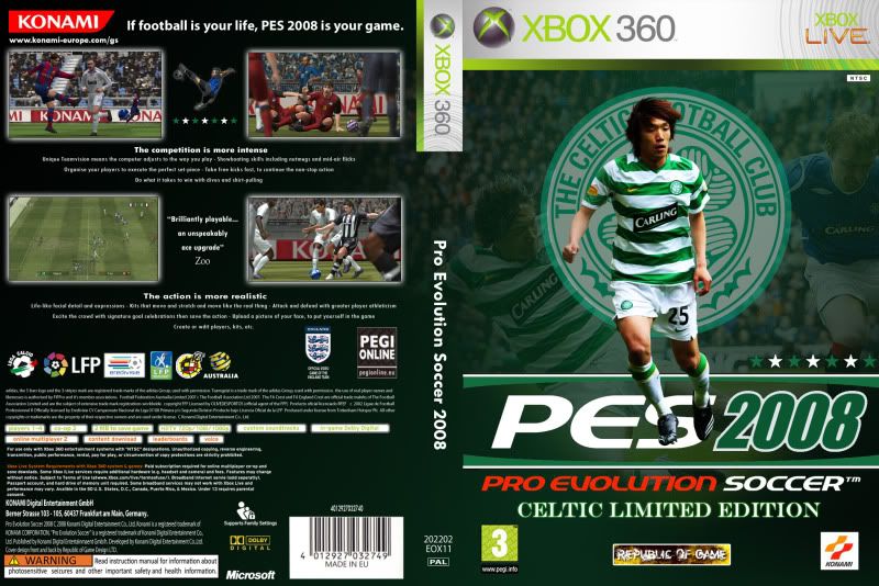
and a friend asked me to do him a Celtic cover for his coverless PES 2008 with Nakamura. The whole box was basically reconstructed to allow a gradient over the back:
 and an Alan Shearer sig I done as a request:


and a friend asked me to do him a Celtic cover for his coverless PES 2008 with Nakamura. The whole box was basically reconstructed to allow a gradient over the back:


D
*Daniel*
Guest
Fixed My Photoshop 
a Arjen Robben sig i made using a tutorial from sport gfx this is my first sig so please be nice
View attachment 83998
a Arjen Robben sig i made using a tutorial from sport gfx this is my first sig so please be nice
View attachment 83998
Fixed My Photoshop
a Arjen Robben sig i made using a tutorial from sport gfx this is my first sig so please be nice
View attachment 83998
ialso used a sportgfx tutorial to make this: im quite proud of it tbh
any improvements i could make?

hiphopahol101
Member
- Joined
- Aug 8, 2009
- Messages
- 662
- Reaction score
- 0
- Points
- 0
Any ratings?
ialso used a sportgfx tutorial to make this: im quite proud of it tbh
any improvements i could make?

Maybe make the logo more visible, but other than that its nice.
Caspian_Rho
Member
- Joined
- Jun 27, 2010
- Messages
- 116
- Reaction score
- 0
- Points
- 0
Any ratings?
Hard to judge an ava like that. So what I will rate you on is overall flow and positioning 5/10 8-|
Obviously the most important thing here is the number and player(that's what the text suggests to me) but you have some of it cut-off!!
I'd move the text down behind the shoulder, make it more prominent and move the whole camera down an inch and take out that bit at the top because it serves no purpose to the ava itself. Your light (lens flare) source is in the wrong place, and I don't think you need it tbh I think for this the brightest shining thing here is your player.......... so that's your flow and your centre.
Hope that helps!
hiphopahol101
Member
- Joined
- Aug 8, 2009
- Messages
- 662
- Reaction score
- 0
- Points
- 0
It does thanks. the only problem is that where it cuts of is where it cuts off on the stock i usedHard to judge an ava like that. So what I will rate you on is overall flow and positioning 5/10 8-|
Obviously the most important thing here is the number and player(that's what the text suggests to me) but you have some of it cut-off!!
I'd move the text down behind the shoulder, make it more prominent and move the whole camera down an inch and take out that bit at the top because it serves no purpose to the ava itself. Your light (lens flare) source is in the wrong place, and I don't think you need it tbh I think for this the brightest shining thing here is your player.......... so that's your flow and your centre.
Hope that helps!
Caspian_Rho
Member
- Joined
- Jun 27, 2010
- Messages
- 116
- Reaction score
- 0
- Points
- 0
Was messing around in PhotoShop and got this.

Ima gonna give you a 7 on this...
I think you could increase the render a bit in size. Another problem I find with this is the centre and text are lost in the expanse of the sig itself. Although negative space is good it undermines the flow and works against it (sig) rather than for it.
To my eye the text should be on the left side and a bit bigger. Again light source should be above left shoulder not arm pit. Shadows on the render suggest that's where the point is.
And maybe for belnds sake I'd do a layer in behind Diego and scatter smudge it and get rid of some of those uneven hardlines around the render (mainly head).
8-|
---------- Post added at 07:13 PM ---------- Previous post was at 07:12 PM ----------
It does thanks. the only problem is that where it cuts of is where it cuts off on the stock i used
lol shouldn't be too hard getting another back of CR7 stock.
---------- Post added at 07:21 PM ---------- Previous post was at 07:13 PM ----------
Fixed My Photoshop
a Arjen Robben sig i made using a tutorial from sport gfx this is my first sig so please be nice
View attachment 83998
A very good attempt for apparently your first sigXD I won't say too much on it. I would encourage you to read advice on what others have been given and adapt that into your own sigs, do a few tutorials and just get a hang of the program. Good effort!!
---------- Post added at 07:41 PM ---------- Previous post was at 07:21 PM ----------
ialso used a sportgfx tutorial to make this: im quite proud of it tbh
any improvements i could make?

Ima give you a 6, flow and centre are key here. Too many contrasts are pulling too many directions for me. I think your text is the wrong colour (too similar to the render itself rather than contrasting) and is in the wrong place, it should come off the render in someway or work towards it, the font style is an extension of the render you see. And it's in it's own space which pulls the eye off the centre (render in this case).
The holland's hero text has no continuity/contrast with the rest of the sig, the font should be more simplier and a more basic font than the main text. It's there to underlie the player text thus making it more subtext so it has to work for it and close to it. Positioning in this case is a seperate comment.
I disagree with Rok on the logo, I think it's too prominent as it is and again occupies it's own space rather than as compliment to the centre, I'd knock down the opacity somewhat and change the colour of it, then tilt it off the centre. It doesn't matter if it's completly visible or not because we already know it's Holland and we're already aware of the logo.
The elements are there for a fantastic sig, you could even do the the 2 text and logo hollands actual flag colours and balance them off the centre ( the centre doesn't always have to be middle btw). Decide what your focal point is and work flow and light off that.
And maybe do a sharpen filter on the player to pull him out a little more....... lol Would like to see the results with a few changes!
Last edited:


