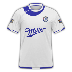
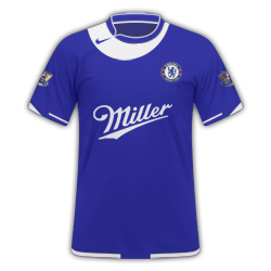
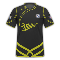
Couple of Chelsea ones in FB, pretty simple designs
Very nice. The away kit is brilliant. Only thing that makes my "score" lower is the fact the logos are a **** of a lot higher than the actual badge
") 8/10 !
8/10 !
Couple of Chelsea ones in FB, pretty simple designs
8/10 !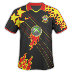

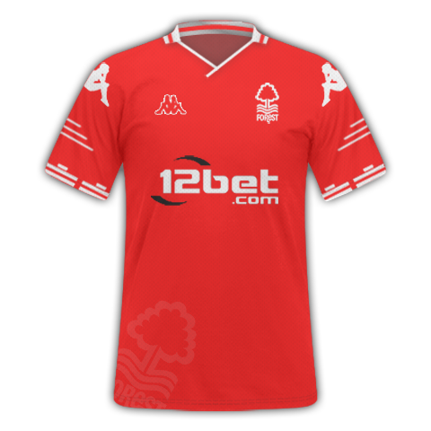
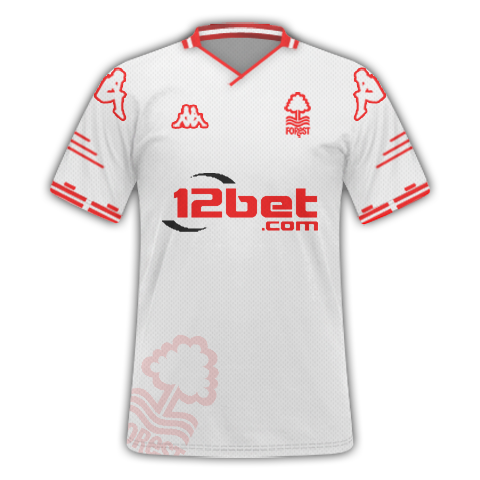
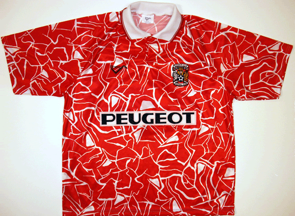
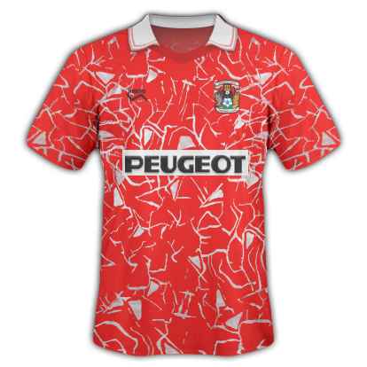
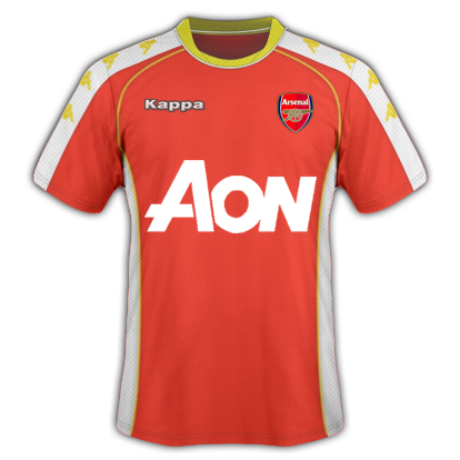
I would try and make the sponsor more visible by adding stroke ( if you're using photoshop ) as it appears to be on the thin side, plus with you having designs on the right hand side of the kit it is kind of restricting your sponsor size so would be best choosing a sponsor that fits well or making it go over your design on the right..Jakec3151
An Arsenal kit please give advice
blackburn
blackburn
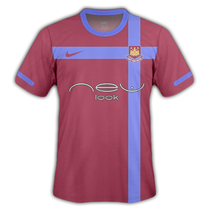
Last one for tonight whu home away third
Here's my Wesr Ham


G-Bentley
")


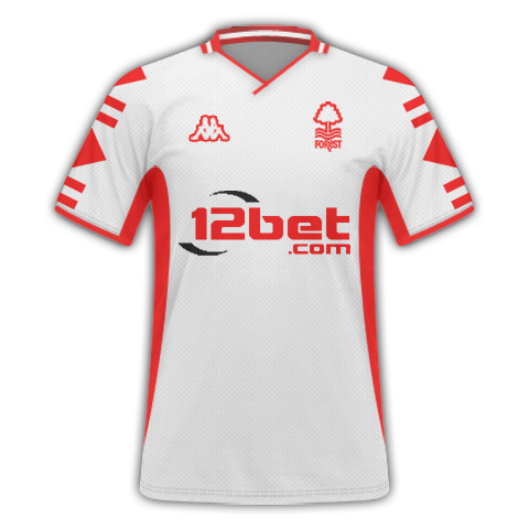
This was another one on my request thread that i was happy with
Few kits for Nuno's request:
Last one for tonight whu home away third
This was another one on my request thread that i was happy with