brianpullen
Member
- Joined
- May 26, 2010
- Messages
- 383
- Reaction score
- 0
- Points
- 0
VERY classy mike, Like that a lot.
how'd u do the back kitAnyone? (A)
is there, whts the link i wanna see that , bet it looks sickNice kit, Mike. Really nice, 10/10!
And yeah, Jose's right, your just adding shorts from FMPT. Besides, there's a guy on Fanboys making a FB style with shorts in it.
is there, whts the link i wanna see that , bet it looks sick
---------- Post added at 03:51 PM ---------- Previous post was at 03:50 PM ----------
and anyway . FM fanboys is offline right now
the templates are the ones that are on smart shirt designer2/10.
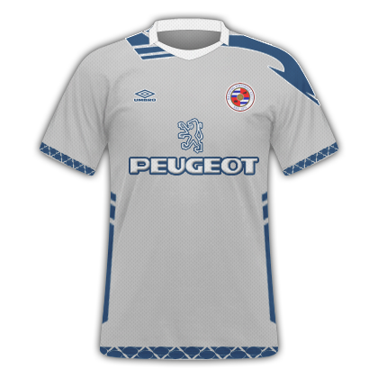
Too bright, absence of a texture layer, apparently random colours mixed in, poor mix of templates and logos are too low.
2/10.
Too bright, absence of a texture layer, apparently random colours mixed in, poor mix of templates and logos are too low.
So what do you think?
Just some quick ones, but i made the colours different, and tried my own design.
Really like the contrast of colours!
you like the contasting colours??
they are too bright and it hurts my eyes
doesnt look like there is a texture layer so im assuming youve used SSD?
Jose22
Agree on the colours, they are way to bright and that badge is huge
