The 'Rate my Kit' Thread

  • Thread starter Thread starter Max
  • Start date Start date
  • Replies Replies 3K
  • Views Views 430K
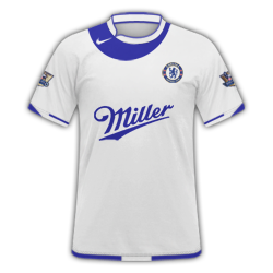
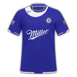
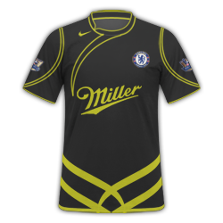
Re-size it otherwise it'll come out with a white backround. Or, upload it to a media hosting site like Imageshack for example. As for your kit, the Chelsea badge is a little big and not too keen on the red half of the kit. Keep trying, you will no doubt improve!
 
Re-size it otherwise it'll come out with a white backround. Or, upload it to a media hosting site like Imageshack for example. As for your kit, the Chelsea badge is a little big and not too keen on the red half of the kit. Keep trying, you will no doubt improve!
Okay thanks for the advice.
 
my latest work:

sabadelltird.png
interhome.png
interawayy.png
interthird.png

arsenalhomea.png
arsenalawayp.png
 
any better??

The colours are too dark, the logos are quite poorly placed and the adidas logo is black and hard to see.

Try giving it a lighter blue, making the yellow bits white and the collar white, the inside of the shirt blue and the adidas logo white and move the adidas logo and the Chelsea logo a bit.

If you're using Smart Shirt Designer, don't. Get Photohsop, or else the kits will turn out very poor. SSD is a bad program to use if you wanna make kits, only use Photohsop. :D
 
Just got Photoshop again today. Haven't made any kits for a few months, so be kind (A)

 
Chelsea ones just don't do it for me. Your a great kit designer, its just personal taste. Nice work though.
 
Back
Top