pieboy_eater
Member
- Joined
- Jul 5, 2010
- Messages
- 13
- Reaction score
- 0
- Points
- 0
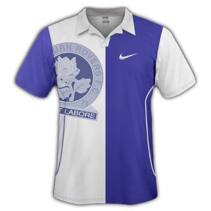
heres my first attempt at Coventry city fantasy Home and away kits, anything has to be better than out kits this year! sponsored by "city link" :S
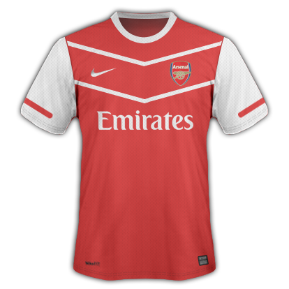
Right here are my two previous Cov kits with added Premier league badges, some slight movements and a coventry 3rd kit. All the 3 look a bit much when together i recon......
")

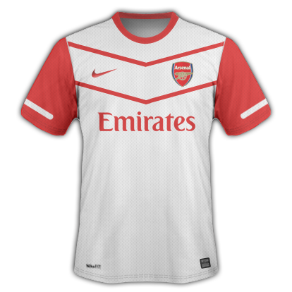
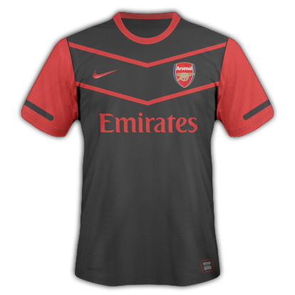
Right here are my two previous Cov kits with added Premier league badges, some slight movements and a coventry 3rd kit. All the 3 look a bit much when together i recon......
BumpWhat do you guys think of my Barca kits?


home and away kits for a team i am making

arent these the 07/08 or w/e that type was with that strips? also im not a fan of that...to much color...germany sticks with 2 colors black and white. for the most part.
arent these the 07/08 or w/e that type was with that strips? also im not a fan of that...to much color...germany sticks with 2 colors black and white. for the most part.
its ok but change the colour of the inner collar to the blue of the stripes
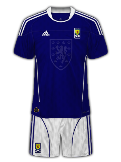
what do u think?