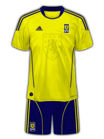
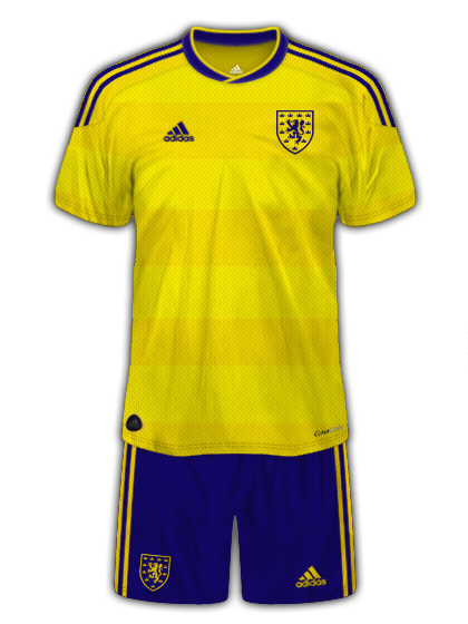
Sorry if it's a bit basic XD I prefer shirts that way.
EDIT: fixed.
Looks decent, but in my opinion badge is a little too big - obviously it's better to be slightly bigger than smaller, but at the moment it's
really big, haha. Perhaps shrink it a tad, but make sure it's still a little bigger than the Adidas logo, that's generally what I aim for.
Also, again just personal preference so you don't have to change it, but I don't really like the bell shaped design that comes off the cuffs: kinda ruins the design of the sleeves.
Oh, and the Adidas kit tag (similar to the NikeFit thing) on the bottom left
could be rotated a
little bit (make sure only a little) and positioned slightly differently so it looks less 2D-like and blends in more.
'Part from those few things though, very solid. 8.5/10
EDIT: Made some new Napoli kits, using the older logo as I prefer it to the new one. Also, experimented a little with some embosses and bevels for the sponsors and badge. It's the technique used to make things look 'sewn' onto the kit (at least, that's what it looks like it does). Curious to see what you guys think of it

(I know people like Mike have used it to an extent to get the same effect, but I'm nowhere near as good, so constructive criticism is welcome).
Home:
Away:
Third:


