You are using an out of date browser. It may not display this or other websites correctly.
You should upgrade or use an alternative browser.
You should upgrade or use an alternative browser.
Rate My Kit Thread - *Please Read Rules Before Posting*
- Thread starter StuW
- Start date
- Replies 625
- Views 440K
Steve*
Y.N.W.A.
- Joined
- Dec 30, 2009
- Messages
- 4,696
- Reaction score
- 4
- Points
- 38
Could do with a stroke on the sponsor logo on the home as its hard to see properly. But other than that nice work. 8/10nice,clean try my friend,although the badge is a bit large and the sponsor too-and a bit low.. 7/10 for both. porto :

View attachment 269588View attachment 269589
Real Madrid, rates and criticisms?
Last edited:


Baldie2k12
Member
- Joined
- Mar 19, 2012
- Messages
- 49
- Reaction score
- 0
- Points
- 0
nice kits, would like to see them in ss template style 8/10
Dundee home/away/third


Dundee home/away/third
Last edited:
Can some one please make me a custom kit for my team fc argyle in these designs
Home kit View attachment 272286 but in a darker green and the away kit View attachment 272287 and could you put and umbro badge in the bottom left corner of the kits and in small gold writting est 2010
Home kit View attachment 272286 but in a darker green and the away kit View attachment 272287 and could you put and umbro badge in the bottom left corner of the kits and in small gold writting est 2010
- Joined
- Apr 12, 2009
- Messages
- 5,944
- Reaction score
- 233
- Points
- 63
rating the Dundee kits, 7/10 my friend,you could change template in order to appear a bit differend !
not.forest :


Not sure I like the template, but a nice simple design. Not sure about the black/white bits near to bottom though. 7/10
My entry for KoTW. Any thoughts?
Mike
Like a glove!
- Joined
- Feb 5, 2009
- Messages
- 8,121
- Reaction score
- 3
- Points
- 38
Not sure I like the template, but a nice simple design. Not sure about the black/white bits near to bottom though. 7/10
My entry for KoTW. Any thoughts?
Not bad. Don't like the sleeves on the home but I like the collar. The away kit is much better. 6/10, 8/10.
Arsenal kits.


I've always just prefered the SS style kits, but these Arsenal kits are really quite nice. I like the simplicity, I reckon the front of the collar on the home could have done with buttons, or something, it seems to just split in to the collars, (if you get me) 7/10, and the away, I really like it, it has a really nice retro vibe with it, and the colours compliment it well. 8/10. Well played.
My fantasy B?/Bolungarv?k (Iceland) home and away for season 2016
View attachment 276097View attachment 276098
My fantasy B?/Bolungarv?k (Iceland) home and away for season 2016
View attachment 276097View attachment 276098


L
lynchyyyy
Guest
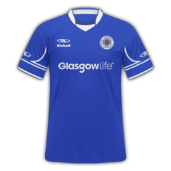
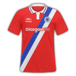
GGGG75: Nice home top, like the gap for the sponser 8/10. Not to fond of the away, dont like the design 5/10.
My first top in a while. Tried replicating Celtic's new anniversary kit.
My first top in a while. Tried replicating Celtic's new anniversary kit.
Away: Not sure whether I like it or not, not convinced by the shoulder. Maybe would have made it a bit darker. 6/10
Home: Like this one, quite classy but I do like quiet kits! 8/10
Also what is this obsession with Arsenal kits all about?
Here are some York City kits for my FM12 Great Leap Forward from BSP>Chumps Lge. I know the red on the home kit is a bit bright and should be darker but can't be arsed to change it:
Home | Away | Third | Euro Away
bornexplorer88
Member
- Joined
- Jun 28, 2012
- Messages
- 1,630
- Reaction score
- 1
- Points
- 38
Away: Not sure whether I like it or not, not convinced by the shoulder. Maybe would have made it a bit darker. 6/10Home: Like this one, quite classy but I do like quiet kits! 8/10Also what is this obsession with Arsenal kits all about?Here are some York City kits for my FM12 Great Leap Forward from BSP>Chumps Lge. I know the red on the home kit is a bit bright and should be darker but can't be arsed to change it: Home | Away | Third | Euro Away
I like the white and yellow shirts... I only have one suggestion and that would be to slightly increase the size of the club logo and move them higher so they are inline with the adidas badge
Design: 7/10
Execution: 7/10
Template: 6/10
These are my designs for my Staines save...
Last edited:
Design: 7/10
Execution: 7/10
Template: 6/10
These are my designs for my Staines save...
Nice kits. I like the mix of sash and chevron in the home, and simplicity of the away and third.
7/10
8/10
8/10
Here are my redone Juve kits.
They look nice and professional, I'd say a 9/10 for each. Maybe move the Juve logo so it looks a bit more symmetrical with the Nike tick.
View attachment 283522View attachment 283521View attachment 283520
Made these for my current save, might use them in FM13 if I get it.
View attachment 283522View attachment 283521View attachment 283520
Made these for my current save, might use them in FM13 if I get it.
Last edited:
Baldie2k12
Member
- Joined
- Mar 19, 2012
- Messages
- 49
- Reaction score
- 0
- Points
- 0
home 9/10
away 6/10
third 5/10


away 6/10
third 5/10
Last edited:
Really like the kits, although I think the sponsor clashes with the chevron and could possibly be a bit lower.
Home 8/10
Away 7/10
Here are my Premier League Puma Blackpool kits sponsored by The Blackpool Tower: (1st, 2nd, 3rd)
View attachment 288745View attachment 288746View attachment 288747
Home 8/10
Away 7/10
Here are my Premier League Puma Blackpool kits sponsored by The Blackpool Tower: (1st, 2nd, 3rd)
View attachment 288745View attachment 288746View attachment 288747
Mike
Like a glove!
- Joined
- Feb 5, 2009
- Messages
- 8,121
- Reaction score
- 3
- Points
- 38
Decent, not a fan of the SS kits anymore so it's hard to put a finger on any praise or criticism. Overall I'll give 7/10.
Arsenal design on a new realisticish kit template made by myself, just a quick draft.

