You are using an out of date browser. It may not display this or other websites correctly.
You should upgrade or use an alternative browser.
You should upgrade or use an alternative browser.
Rate My Kit Thread - *Please Read Rules Before Posting*
- Thread starter StuW
- Start date
- Replies 625
- Views 440K
Struggling to find a fault with these. The only thing I could say is that the collar on the away would look better with the Austrian red-white-red rather than just red-white, and that's entirely trivial anyway. I really like the sleeve details that are becoming common in your designs. 10/10some Austrian kits :


On another note, thanks for the logos. Could you tell me the name of the font for the first one?
Chelsea kits:


Still practising, trying things out and basically messing around right now in preparation for KotW.
Three quality kits there mate.
H: 9/10. Really nice kit that fits Chelsea very well. I like the two similar shades or blue in the vertical lines. The once thing that I would personally consider changing is the colour of the blue patch on the arms. To me it just seems a bit too bright compared to the base shade of blue, though it may just be me")
A: 8/10. A Nice away kit, and I especially like the shade of green you used. The only problem is that to me, the green 'shapes' touching the premier league badges looks a little dodgy. Perhaps if the green shapes were moved up just a little? Again, it may just be me.
T: 10/10. Beautiful kit. The red, white and blue go extremely well together and the faded rising lines look very nice indeed. If I'm honest I don't really have and complaints with this one, practically perfect. Also, where did you get the sleeve badges? Would like to use them in my kits.
I haven't done kit making in a while and decided to give this template a go. Please also tell me which kit you prefer as well as rating it?
View attachment 377901View attachment 377902
H: 9/10. Really nice kit that fits Chelsea very well. I like the two similar shades or blue in the vertical lines. The once thing that I would personally consider changing is the colour of the blue patch on the arms. To me it just seems a bit too bright compared to the base shade of blue, though it may just be me
A: 8/10. A Nice away kit, and I especially like the shade of green you used. The only problem is that to me, the green 'shapes' touching the premier league badges looks a little dodgy. Perhaps if the green shapes were moved up just a little? Again, it may just be me.
T: 10/10. Beautiful kit. The red, white and blue go extremely well together and the faded rising lines look very nice indeed. If I'm honest I don't really have and complaints with this one, practically perfect. Also, where did you get the sleeve badges? Would like to use them in my kits.
I haven't done kit making in a while and decided to give this template a go. Please also tell me which kit you prefer as well as rating it?
View attachment 377901View attachment 377902
Three quality kits there mate.
H: 9/10. Really nice kit that fits Chelsea very well. I like the two similar shades or blue in the vertical lines. The once thing that I would personally consider changing is the colour of the blue patch on the arms. To me it just seems a bit too bright compared to the base shade of blue, though it may just be me
A: 8/10. A Nice away kit, and I especially like the shade of green you used. The only problem is that to me, the green 'shapes' touching the premier league badges looks a little dodgy. Perhaps if the green shapes were moved up just a little? Again, it may just be me.
T: 10/10. Beautiful kit. The red, white and blue go extremely well together and the faded rising lines look very nice indeed. If I'm honest I don't really have and complaints with this one, practically perfect. Also, where did you get the sleeve badges? Would like to use them in my kits.
I haven't done kit making in a while and decided to give this template a go. Please also tell me which kit you prefer as well as rating it?
View attachment 377901View attachment 377902
i prefer the one on the right, i dont think the box around the sponsor works on the first kit but the general style is great, i like it.
9/10
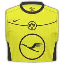
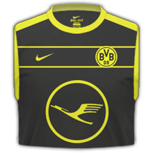
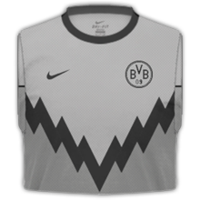
Some Dortmund kits i made a while back using a template i have edited myself using FBkits as a starting point.
Thanks for your feedback, I will take it on board. Although, on the first kit, the sponsor was deliberately off-centre, I was just experimenting. Your kits are great, by the way!as for your kits : nice design but you must be carefull your designs to flow better with the template.Also,too big sponsor and not center allocated on the shirt.
6/10
7/10
below,some Austrian kits :
PL Sleeve Badge: http://transatsports.com/store/images/EPL Patch 201011.pngAlso, where did you get the sleeve badges? Would like to use them in my kits.
PL Champions Sleeve Badge (it says 09/10 but you can colour over that): http://image-load-balancer.worldspo...&photoNum=1&t=I&catalog=SoccerUCL&w=600&h=600
SkyBet FL Sleeve Badges:


I like the concept behind this template - it works well since that's where the detail is on shirts and the way it looks is brilliantly similar to a folded shirt. Home and away are both great in the way that they use the BVB logo. The logo on the third kit looks a bit dodgy but otherwise it's fine.Some Dortmund kits i made a while back using a template i have edited myself using FBkits as a starting point.
copy of Burton's 13/14 kit (front and back, completely from scratch except the collar)
I've had a lot of free time lately...


much better my friend !!! i like the number font-tell me the name of it btw-and the way the lines adjust to the kit !!!
Also good use of tones on yellow and a good sponsor size !
the name of the font for your logo is called FORQUE.
8.5/10
below,a different approach on french kits :


Also good use of tones on yellow and a good sponsor size !
the name of the font for your logo is called FORQUE.
8.5/10
below,a different approach on french kits :
much better my friend !!! i like the number font-tell me the name of it btw-and the way the lines adjust to the kit !!!
Also good use of tones on yellow and a good sponsor size !
the name of the font for your logo is called FORQUE.
8.5/10
below,a different approach on french kits :
I like your home kit, it's simple but effective, I'd like to see more blue on it though, if you took off the badge you'd have no idea it was France. 7/10. Your away kit is interesting, it's a paler shade of pink so it isn't as bad on the eyes. But I suppose the away's a bit like Marmite, you either love it or you hate it. 5/10
I've only just started using Smart Shirt Designer and making kits so I wanted to know what someone thought of my Blackpool kit. Any advice on making better shirts would be much appreciated. (By the way I've added my away shirt as well)View attachment 378189
View attachment 378156
Last edited:
Both kits: 8/10. Both pretty decent kits. I do prefer the home kit slightly more than the away kit, mainly because of the badge on the orange section of the away kit. I must admit I'm not familiar with the smart shirt designer so I'm not sure how easy it is to change the colour of the badge. I also would like if you made the shirt manufacturer logo a bit bigger, it looks a bit odd being so small in comparison to the badge. But still nice kits.
My Swansea city away kit:
View attachment 378889
My Swansea city away kit:
View attachment 378889
Last edited:
bartolomeofc
Member
- Joined
- Dec 10, 2010
- Messages
- 46
- Reaction score
- 0
- Points
- 6
Nice... looks a bit weird with this sponsor, but a well made kit ") I would say 8/10
I would say 8/10
My Lechia Gdańsk set
View attachment 379086View attachment 379087View attachment 379088
I would say 8/10My Lechia Gdańsk set
View attachment 379086View attachment 379087View attachment 379088
dannybaker
Member
- Joined
- Feb 23, 2013
- Messages
- 1
- Reaction score
- 0
- Points
- 0
Great kits, i like the new Adidas template, maybe you could've changed the green on the sponsor, make it transparent? 9/10
Away, i don't like interrupting adidas stripes on the sleeves haha 7/10
Third, would look better w/o stuff on the lower part of the kit IMO, 7/10
Ok, my first try with Kev's template, Malaga, copying Nike's current trend of coloured sleeves etc.. Also my skewing skills are horrible, can't line up the sponsors and badges properly. Also no idea how to convert them to png w/o artifacts, i just use Save As in PS
View attachment 472832View attachment 472831View attachment 472830
Last edited:
I like those kits, but the sponsor seems to be too big, and takes away from the whole thing in general.
Well, I haven't made kits in years, so I fished out these old Fiorentina ones I made a long time ago. Still sexy xD
View attachment 472332 View attachment 472331 View attachment 472330
The alternate kit was never my favourite, but that home kit, I'd have that in RL anytime, now if only they'd use a kit I made
Mike
Like a glove!
- Joined
- Feb 5, 2009
- Messages
- 8,121
- Reaction score
- 3
- Points
- 38
The colour scheme in the third kit is a bit dull, but maybe it's just in comparison to your first two kits. Not sure the faded stripes work on the home but definitely does on the away. 6/10, 8/10, 4/10.
Arsenal kits, how it would look in short and long sleeve.

Nice kits, and they fit with Grimsby's colour scheme too. However, I feel that the sponsor logos are too high up (I'm pretty sure they should be slightly lower, although I may be wrong). Great kits, though! 9/10, 6/10, 7/10.Grimsby Town - Home, Away and Third.
bornexplorer88
Member
- Joined
- Jun 28, 2012
- Messages
- 1,630
- Reaction score
- 1
- Points
- 38
Grimsby Town - Home, Away and Third.
Really nice design, looks very realistic... I would only suggest maybe a slighty larger sponsor, but that would just be nit picking
H: 7/10
A: 8/10
T: 7/10
What you all think of these kits for Staines, I might add the league badges later in my career when i get promoted to the Prem haha,
View attachment 446394
Ali G
Manager
Home -Away-Third
View attachment 446392View attachment 446391View attachment 446393
Ali G
Manager
Home -Away-Third
View attachment 446392View attachment 446391View attachment 446393
kristoffer98
Member
- Joined
- May 30, 2010
- Messages
- 1
- Reaction score
- 0
- Points
- 0
Cool design, and i like the tying on the homekit.
(Sorry if my english is bad)
My Sporting CP kits:
bornexplorer88
Member
- Joined
- Jun 28, 2012
- Messages
- 1,630
- Reaction score
- 1
- Points
- 38
Really like the design on the away shirt.Cool design, and i like the tying on the homekit.
(Sorry if my english is bad)
My Sporting CP kits:
I would look at changing the logo on the home, personally i don't think it looks right. (i dunno if it's the sizing or...)
Well here are my new Derby County kits, i love how th away shirt came out (maroon one)
View attachment 435642View attachment 435641View attachment 435640